Driver Training for TR Group Web-app/saas product
Reimagining the DT Driver Training website was never going to be a small task.
More work with my friend and ex-colleague Darren after the TR Group video training system (which I later found out won the Transporting New Zealand Innovation Award!).
Part way into the project I got to see the original XD layout of this website from my friend and ex-colleague Phil Bannister - haha the Terabyte team back together again out of synch by a few years :) The solution had grown exponentially since that launch.
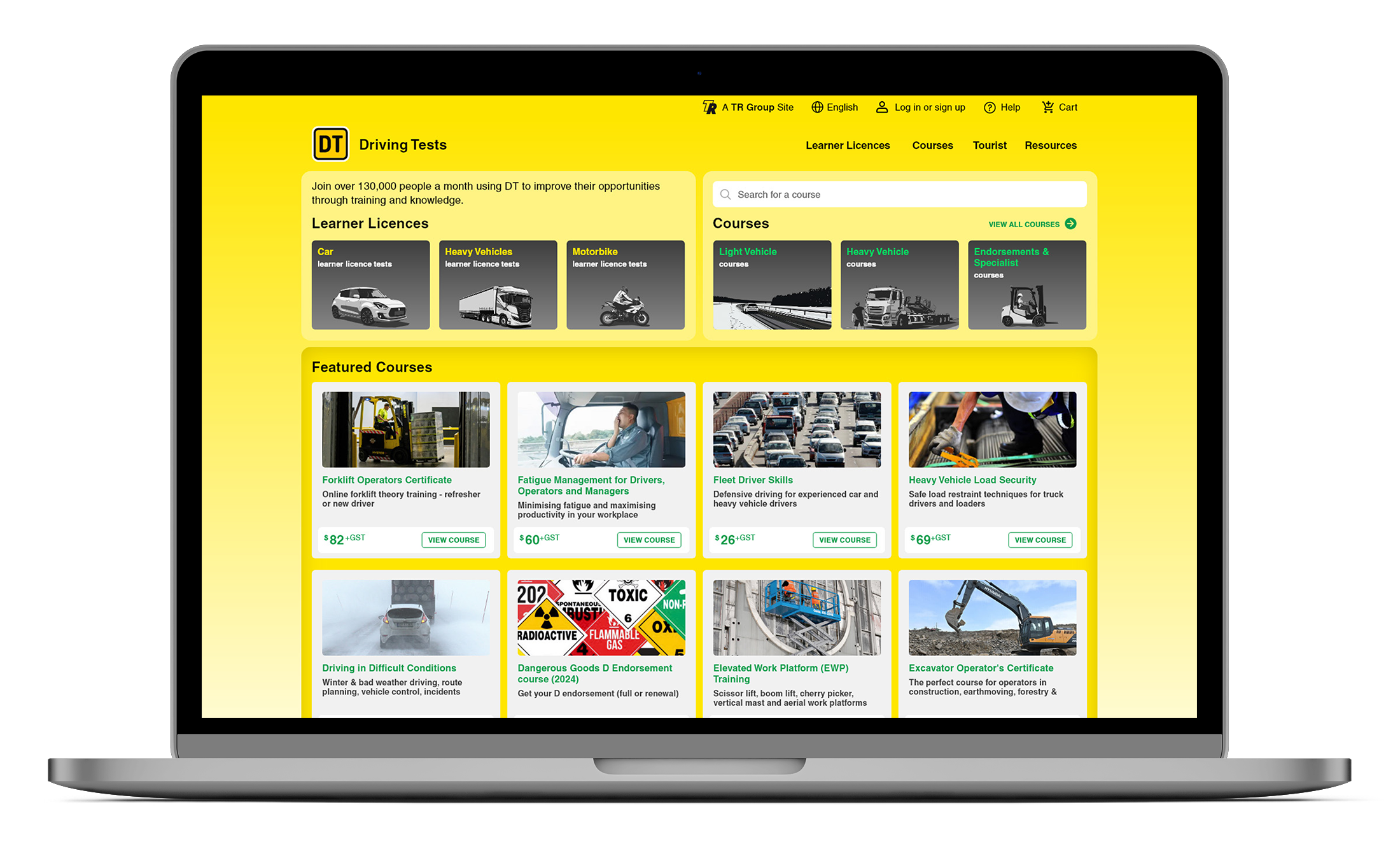
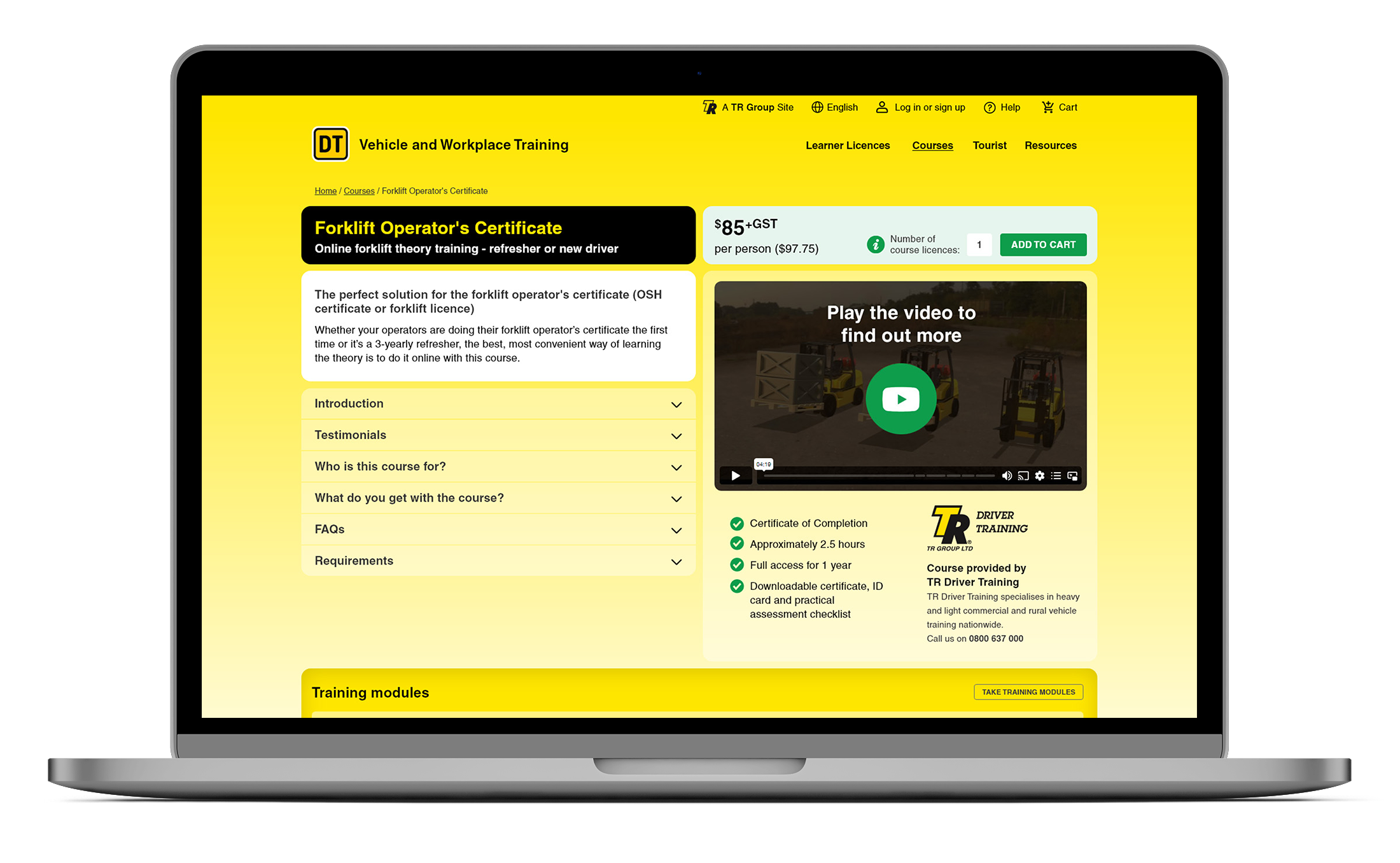
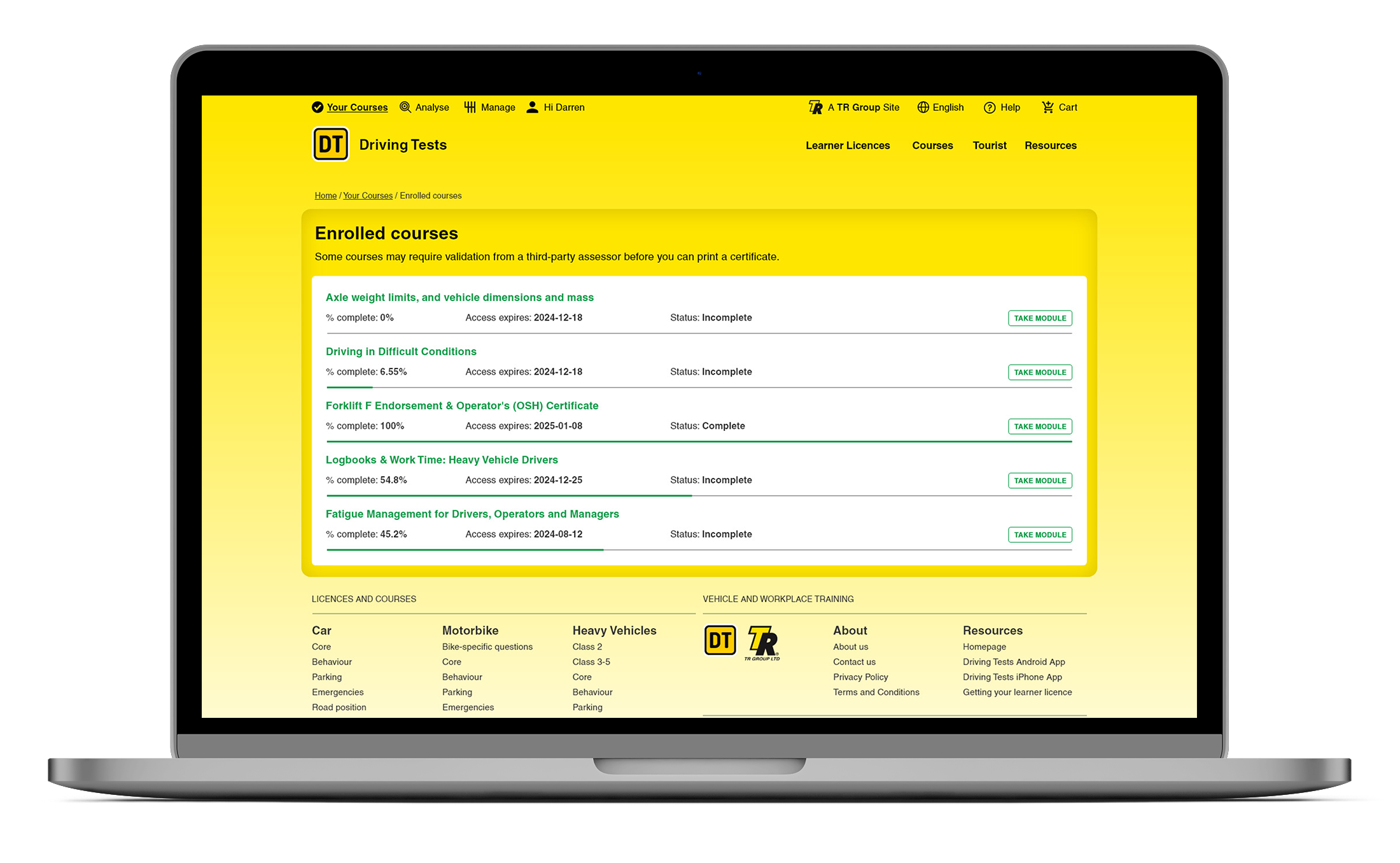
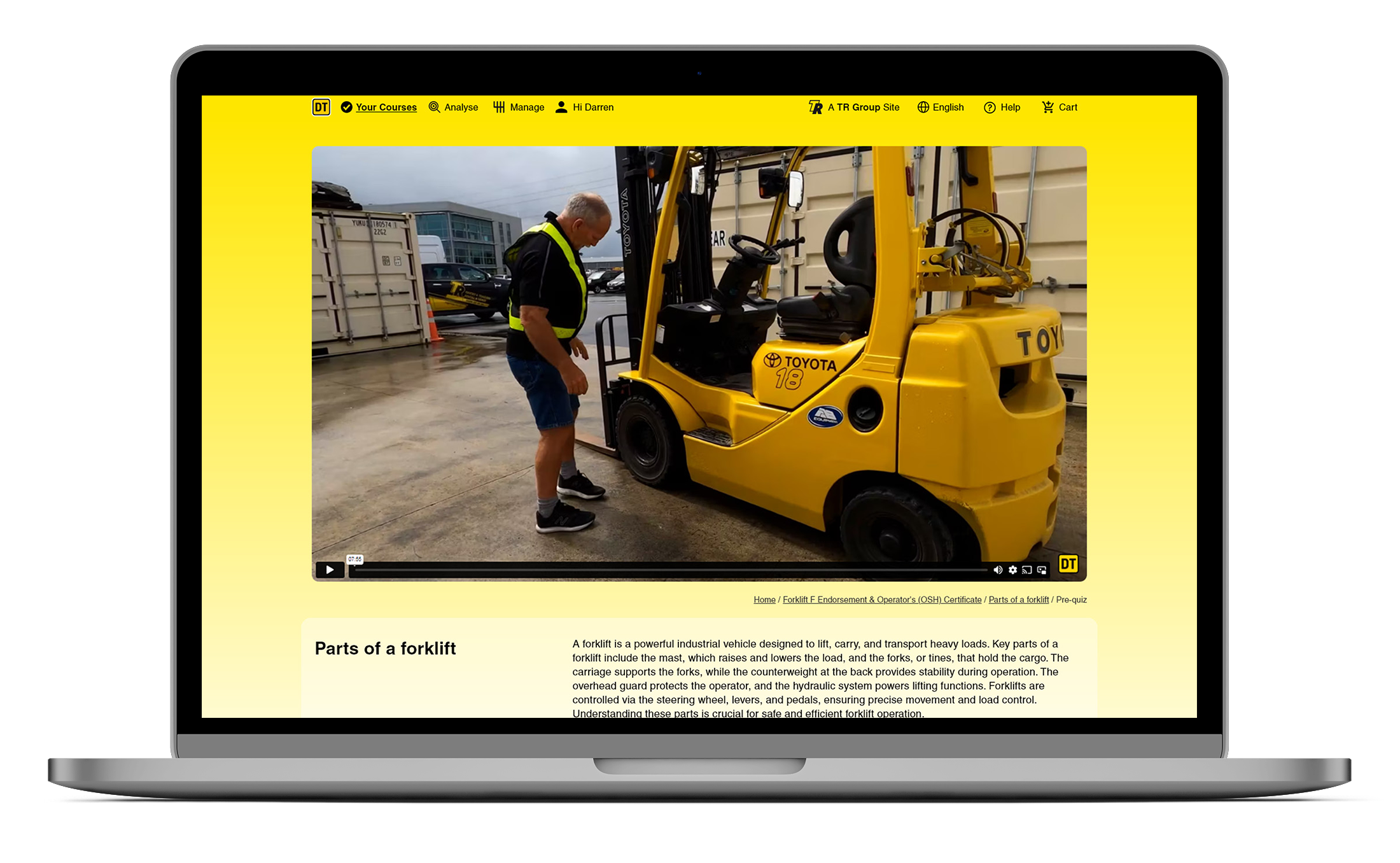
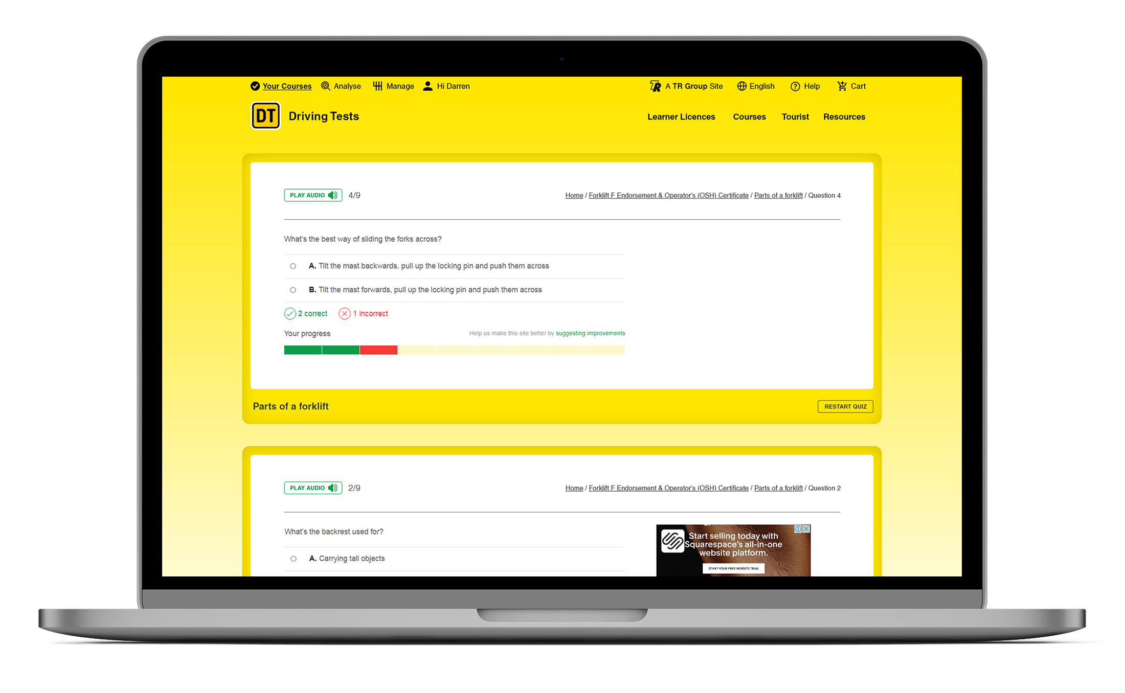
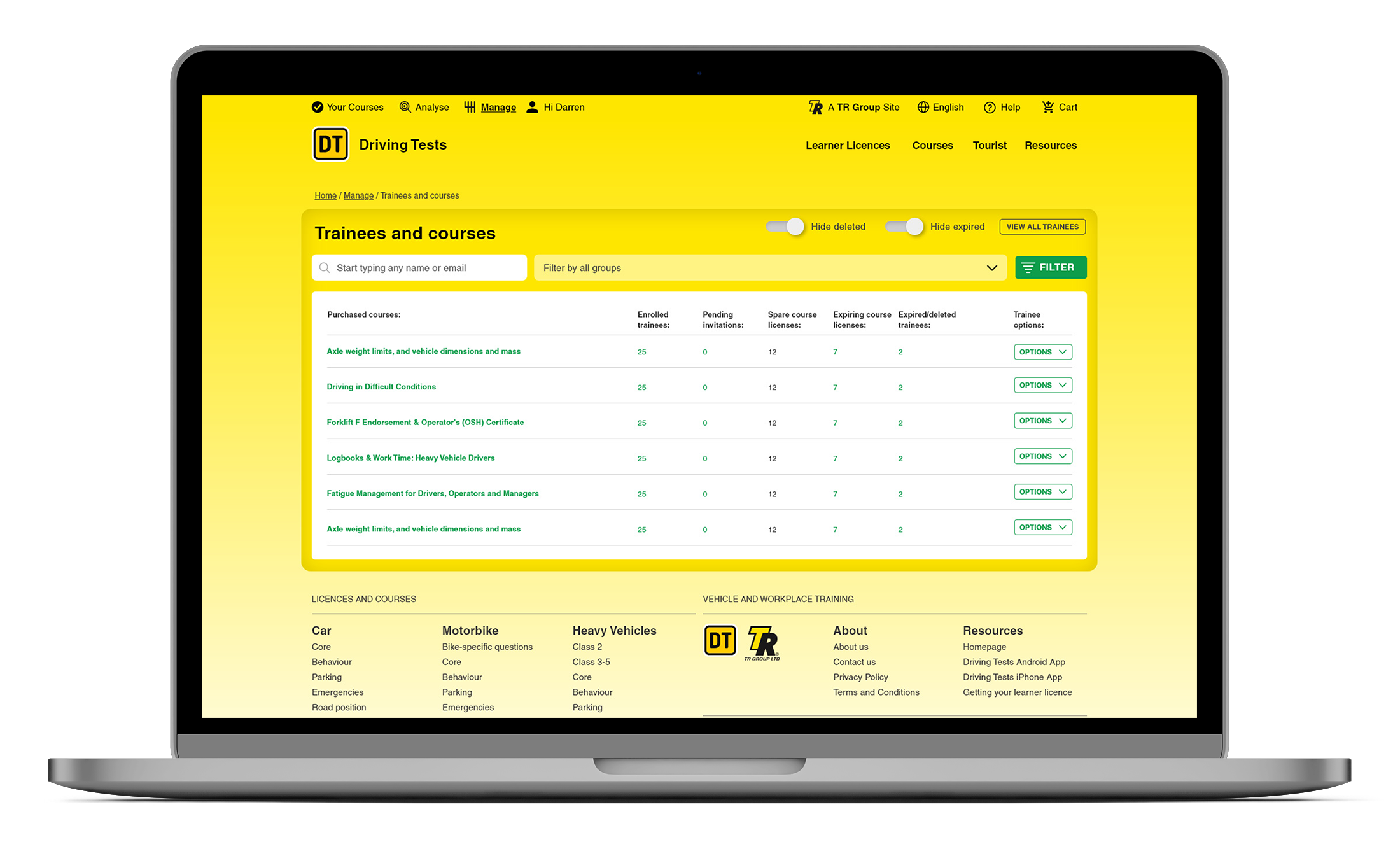
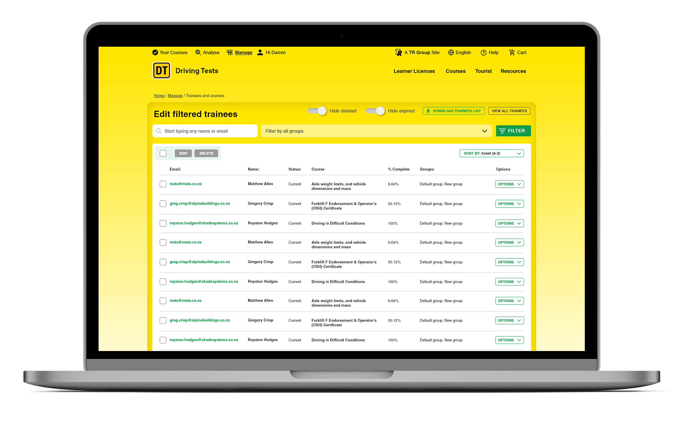
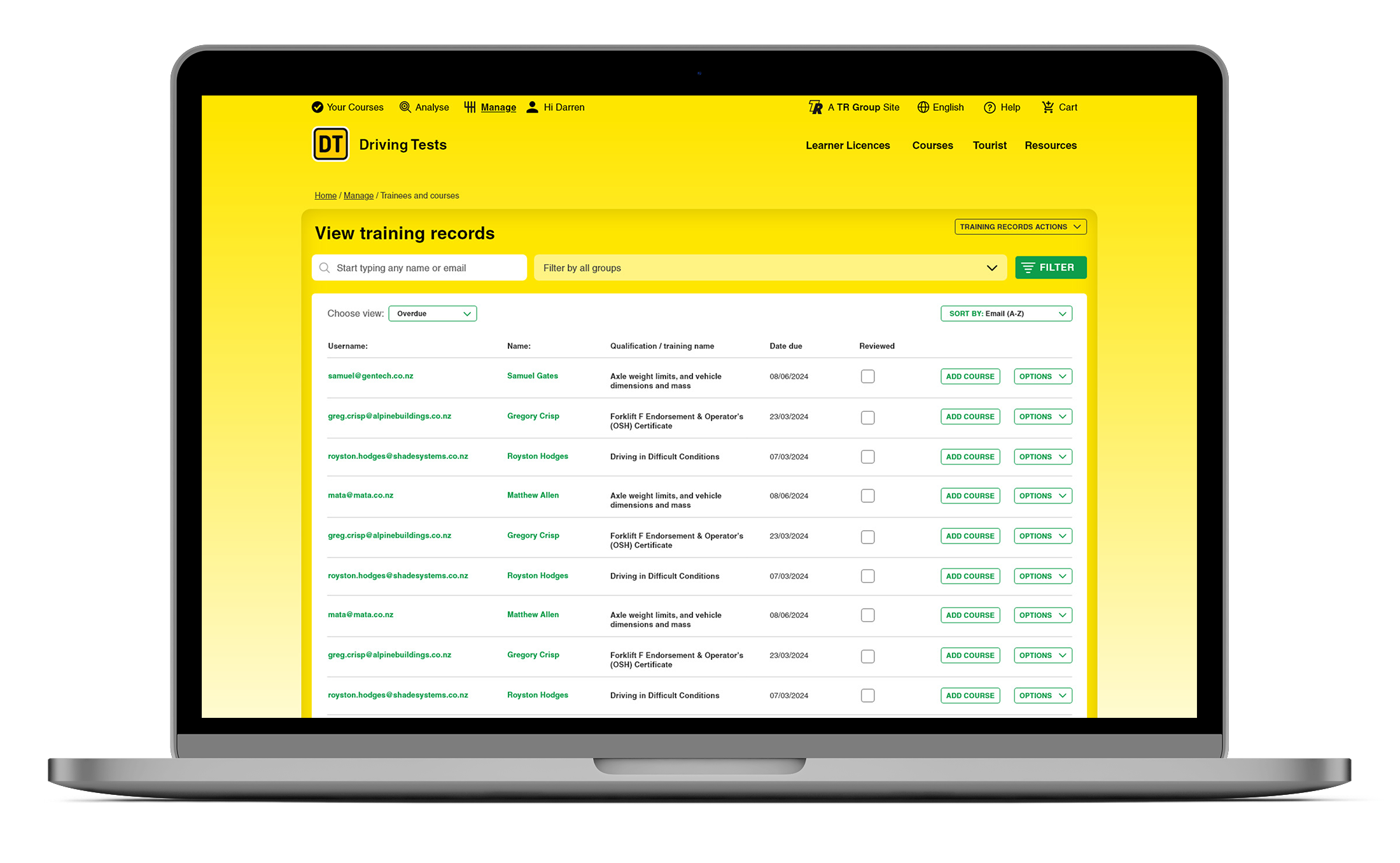
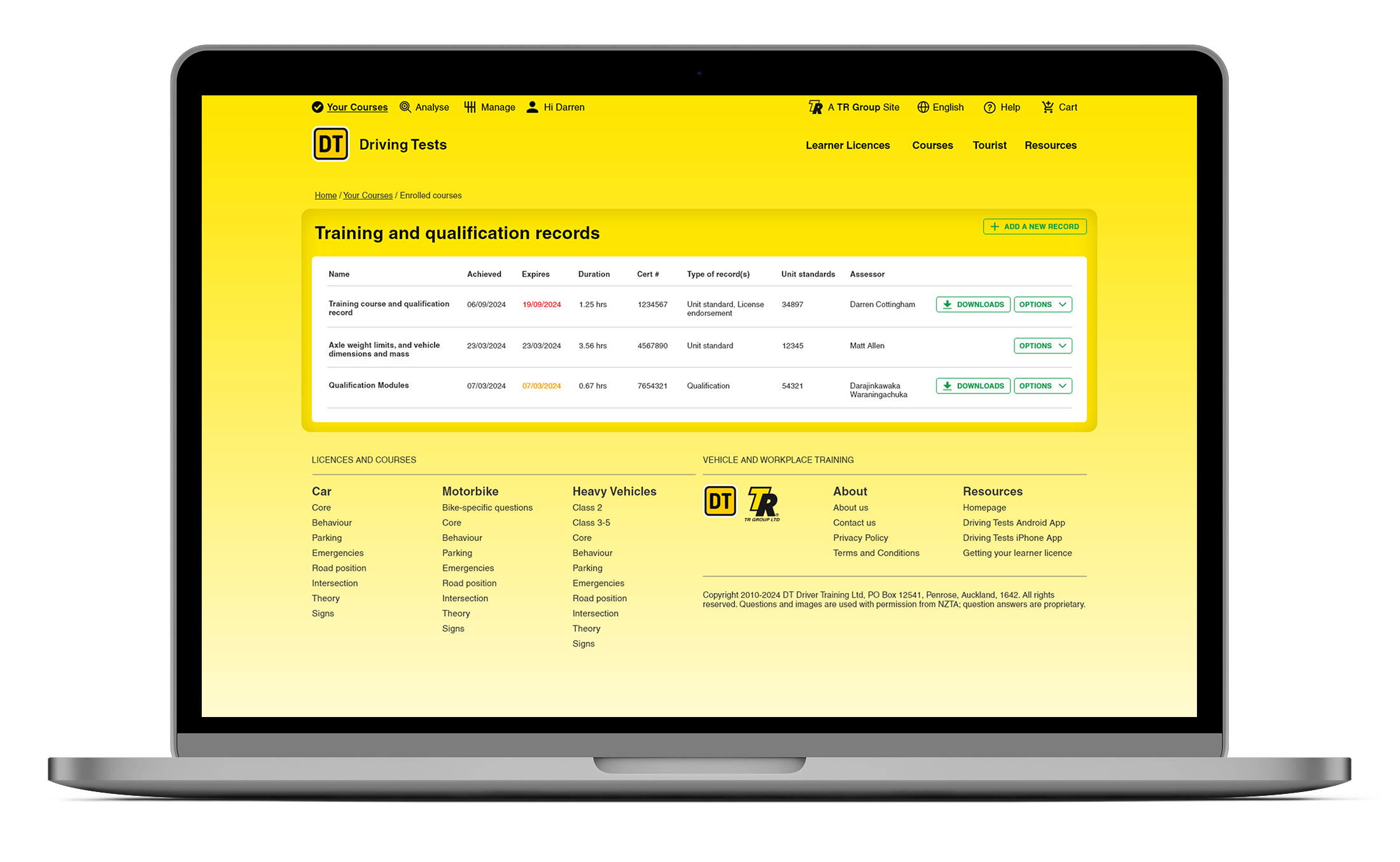
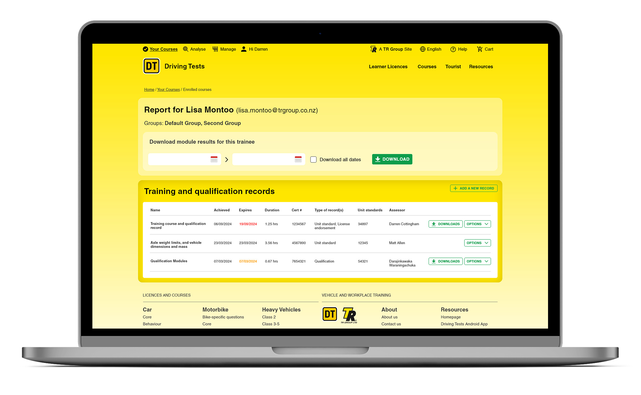
Now a complex training system with driver training and commerical trainee management for companies. The solution had had many additions from developers to boost functionality but that lead to unforseen problems. This wasn’t just a fresh coat of paint, but a complete rethink of how the platform works, looks, and feels for thousands of users each month. From course discovery to checkout, from managing trainees to downloading certificates, every part of the experience needed to be brought up to date. Pictured are some captures of the website before the redesign.

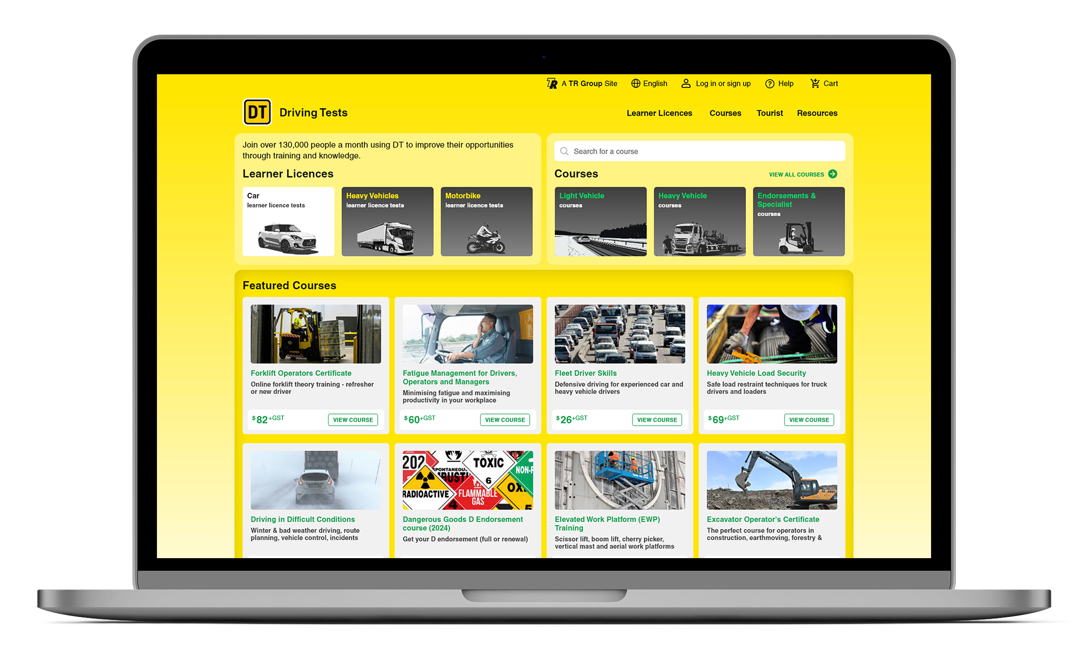
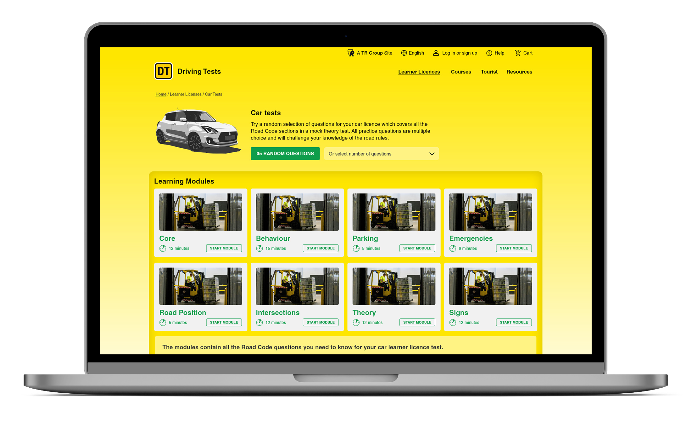
Captures of the Driver Training Website as it was in 2024. Starting off as a much simpler offering, as services do, over time, the software grew exponentially to become a huge resource and training tool for some of New Zealand’s largest businesses.
Design solution
Darren already had a document full of potential improvements to the usability and consistency across the solution. Those were briefed in to kick off the project, these were a good starting point for the upgrade.
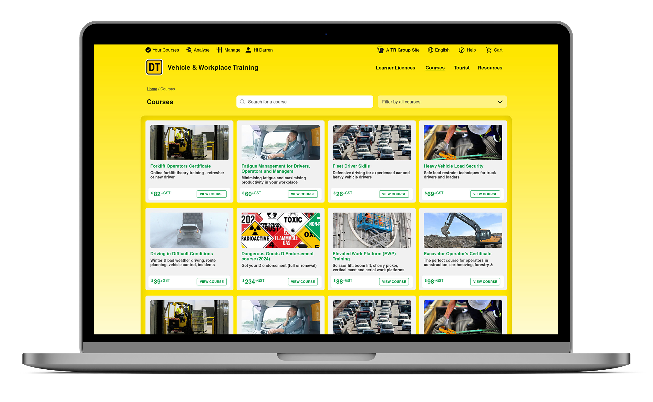
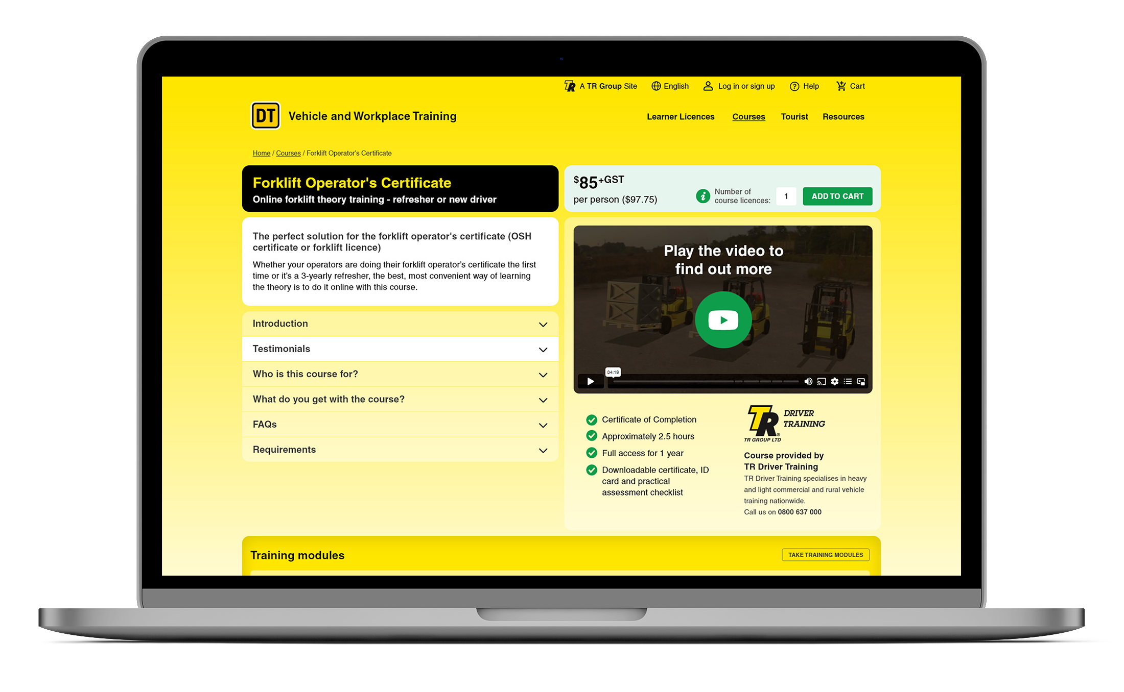
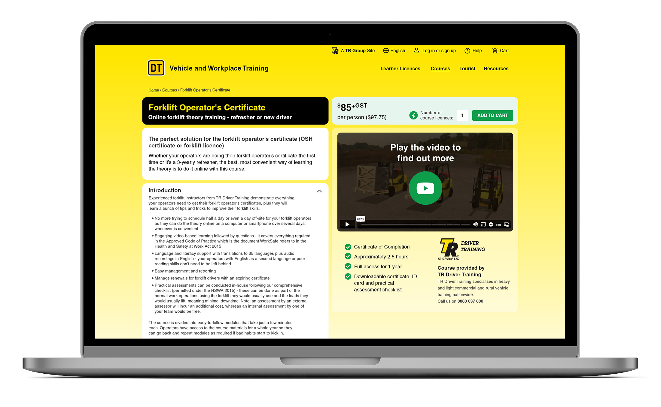
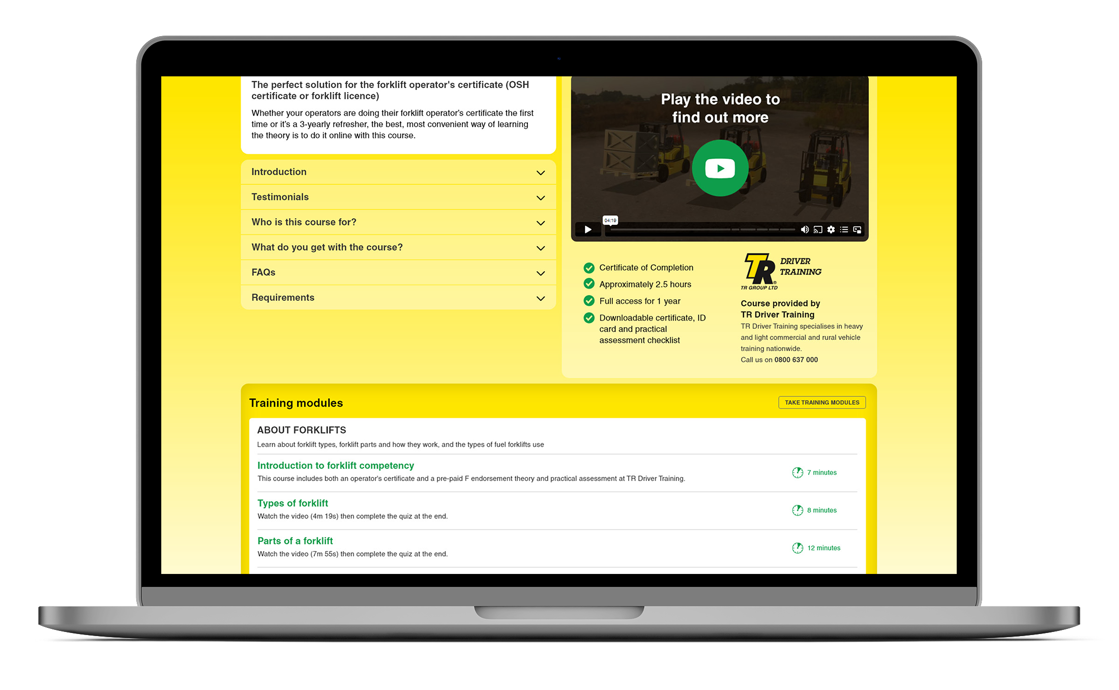
I set out to create a cleaner, wider, more consistent interface that had much better grouping of UI tasks and information. Focus-point rollovers were used extensively to help the use cut through a load of information. Using a global view to standardising styles, improving layouts, and making information easier to find. This included reworking the pages to showcase more info above the fold, modernising the course catalogue for a growing library of 80+ offerings, and introducing better filtering and upsell opportunities through course linking.
Beyond the public-facing changes, Darren and I also overhauled the back-end user experience for managers and trainees. Using interactive rollovers, improving navigation, and aligning functions across the site so they feel logical and predictable. TR Group co-branding was woven into the design. Resources were reorganised into intuitive pods, and huge amounts of content was transoformed for a better user experience.
The result is a platform that’s not only more user-friendly, but also more capable of supporting Driver Training’s mission: giving more than 130,000 people each month the tools and knowledge they need to improve their opportunities on the road and in their careers. The screenshots are phase 1 XD screens - so the content it faux and sometimes repeats.