Driver Training Phase 3: Dashboard & More
Phase three updates prototyped for the DT system.
One thing I had mentioned to Darren about getting a better user experience for all was the concept of choice. This is not an easy solution as it’s customisation of the experience.
We’re quite used to this in some software platforms, one thing Adobe shines at is interface and usability customisations. These customisations creep into eCommerce as I learned a long time ago, each shopper is different in their needs and habits.
DT Dashboard
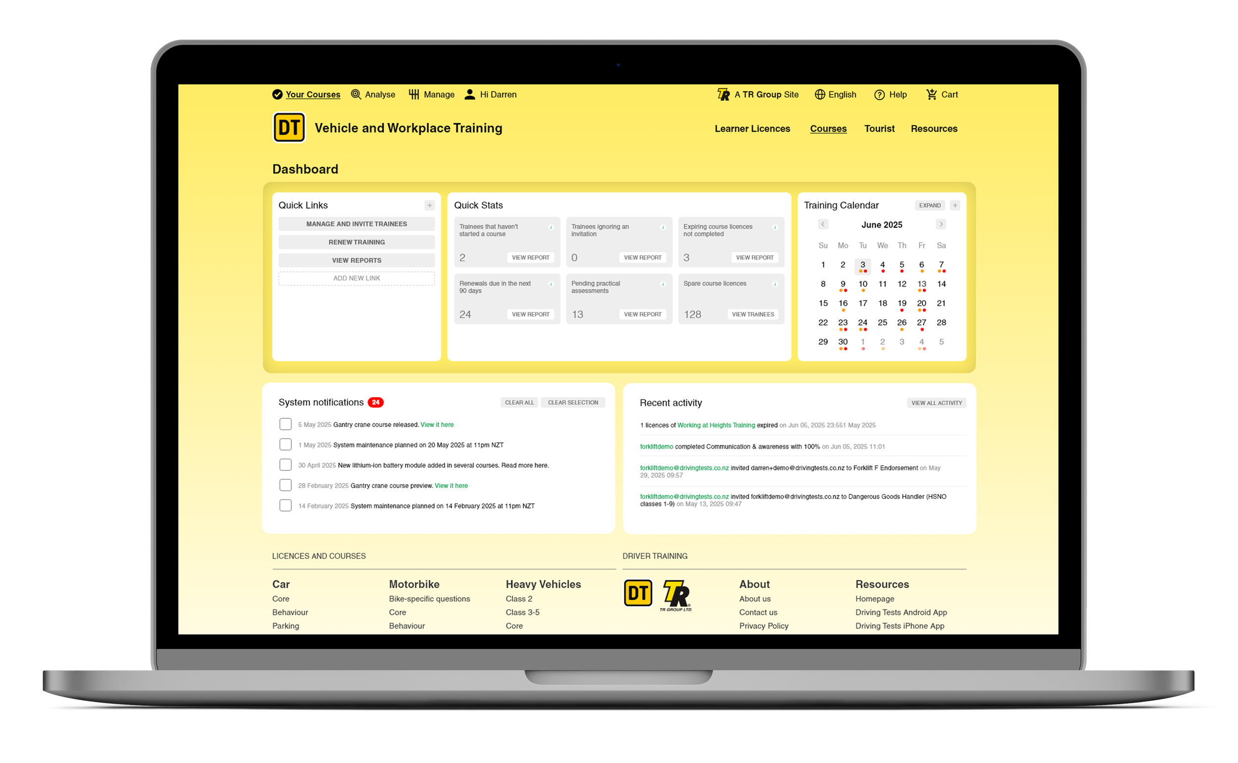


There are many areas for improvement across the system and the dashboard was one for power users. For the corporate users of DT, who may have over 1000 people taking courses, we provided a semi customisable dashboard system. The dashboard is divided into sections of task driven features. Each pod contains handy data touchpoints and views. The most complex part of the dashboard is the calendar system. Calendars are notorious for struggling with numerous events on one day.
The design of this calendar uses two kinds of pop ups. Firstly, the day can be tapped and expanded, indicated by the dark grey box on the calendar and represented in a grey box displaying the days data. The whole calendar can be expanded and show a maximum of four months across; those months can be scrolled left and right. Below the expanded calendars is the months lists of alerts. The calendar system is designed to be ready for mobile with the only change being the count on the expanded calendars.
Both calendar pop ups use a dot indication system, showing the nature of the alert, and within the alert there can be multiple trainees. The idea is to get a snapshot of what courses, certificates and trainees need refreshers, certificates, or re-licensing.
User Experience Updates
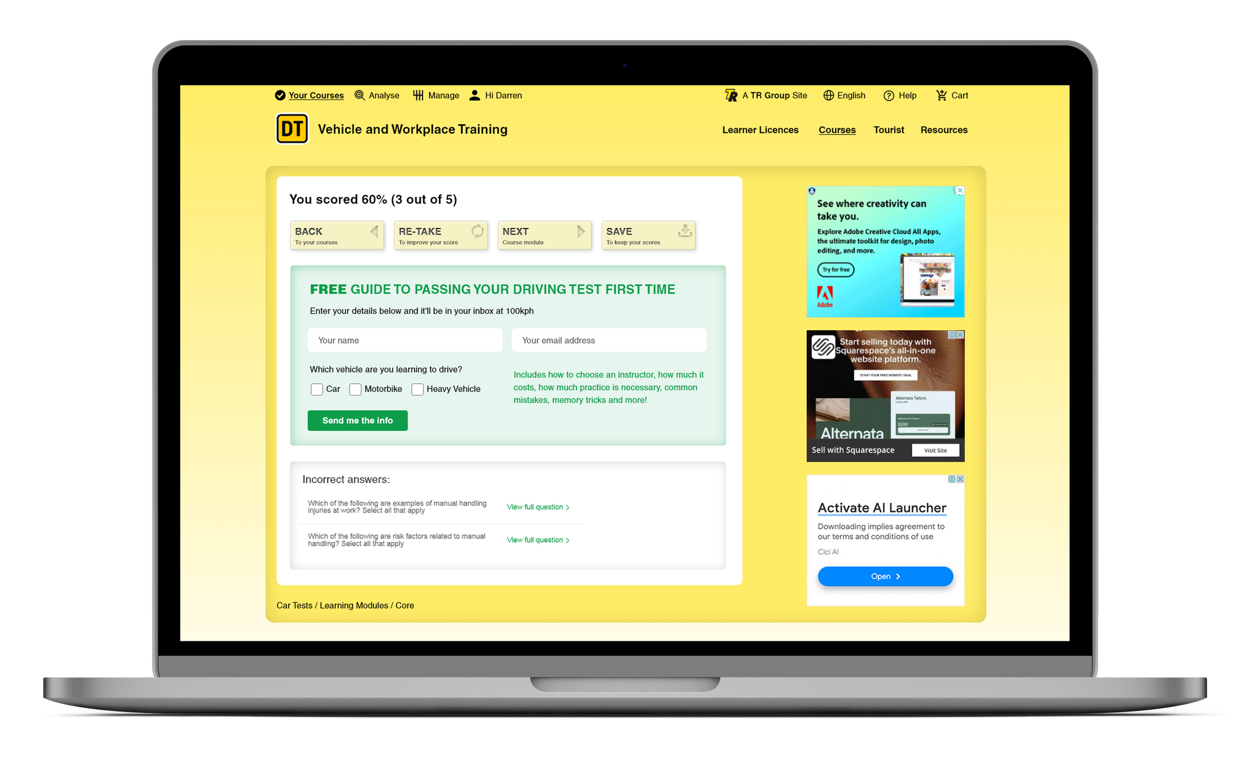
More screens were also prototyped for the end of the quiz, with results and CTA for the free-to-use advertising side of the solution. Improving the buttons to direct their path. First the signed in user is presented with directional buttons now instead of equal weight heavy green buttons. The new buttons have subtle icons to show the pathway and also be a visual key for users to spot when doing a large number of modules. The new buttons have a slight 3D pop to them while also being subtle inside the ending pod. This was to initiate a push-me trigger in the brain. The styling of them is intentially different to get attention while not upsetting the hierarchy of the page.
Functionality Improvements
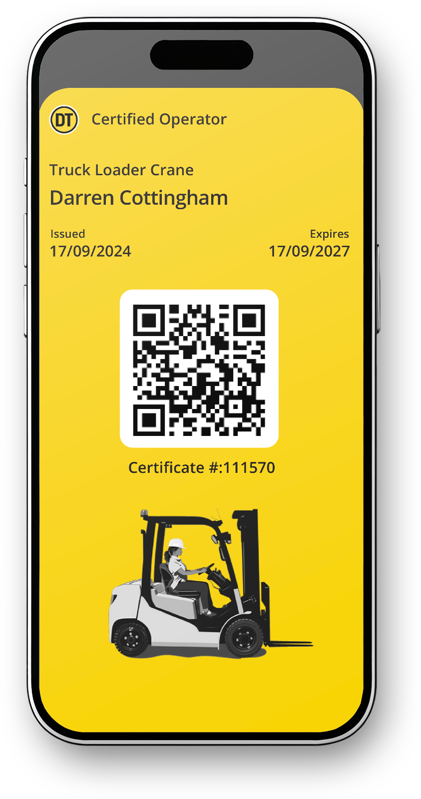
Google Wallets for certificates has also been added, and a new phase-two style button was created for that. Drivers and workers can now use their phone’s built in digital wallet to store their training qualifications.
On the course pages, a ‘combined module’ accordion solution was also added, which could be a user choice option for the future. Some training programs have over 20 modules, and that was seen as too much data - which we agreed was the case. I had tried to aleviate this load by segmenting the modules into pods with rollovers. This did a good job of giving a focus point but in the long run lots of modules is still lots of modules. The new update condenses the storage or the module descriptions which also makes the page size shorter.
The DT Vehical and Workplace system is huge now, so it’s got a lot of improvements to go across the board - making the complex > easy, making the difficult > fun, making the painful > convenient, on we go :)