Loopli Rebrand with Wedge
Built for Momentum, Conection and Direction
I’ve recently had the chance to work alongside Ryan Mitchell (Wedge) and Jack Morgan to rebrand Loopli, a performance-driven marketing platform focused on creating multiple inbound channels and marketing clarity in the tradie sector.
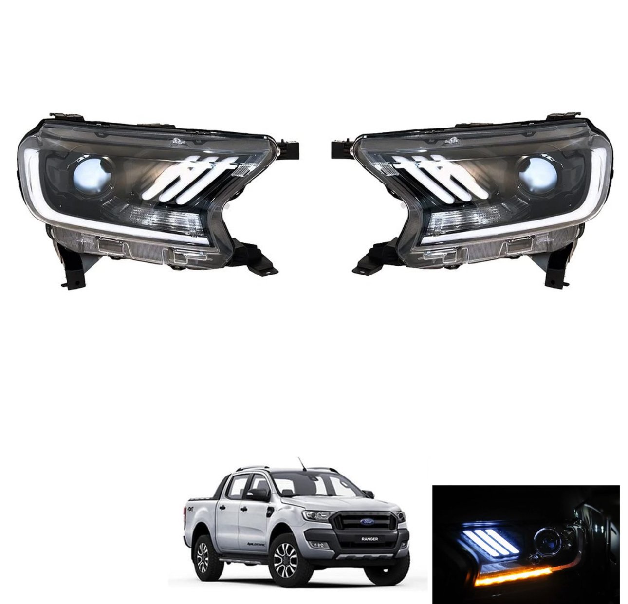
The headlamp design that inspired the logo.
When taking on the brief something was clear: this cant be just another "loop" based brand. That’s where the challenge really began. The loop design logo space is a saturated one, full of logos that spiral without real intention. The previous identity had a nice linking aspect, but it needed sharpening, something with more flow, more structure, more weight.
The brief was ‘black Ranger’, imagine deep black, sharp lines, led lights and an imposing stance - and when sourcing some inspiration I came across Rangers with these headlights, and older version of the current opposing C shaped lights, but liked the three stripes of bright LED light coming through punching bright in the headlamps.
Starting with Real-World Inspiration
When I sat down and started with the initial sketches, it became obvious that a custom typography solution was needed. Type testing revealed letter combination factors. I worked through a number of logo device and logotype concepts, analysing everything from character gaps, negative space and cap heights. In the word LOOP, for example, the O-O-P sequence connects more strongly than the whole brand name. I explored how to counterbalance that, redrawing and refining what eventually became a customised Helvetica Ultra Compressed logotype. The compressed version minimising gaps between and inside the letters.
The chosen logo device, the Tri-beam Quad Spiral, represents momentum and direction: multiple channels rotating around a core, building pace. It deliberately avoids the cliché of an endless, aimless loop. If looking at the headlamp LED shapes, it was a combination of the long beam and three stripes. The geometric perpandicular design was given an italic angle to match the type and create movement in the design.
Sampling Colours from Tools
The colour palette came from the real world, literally. I sampled from the tools tradies use every day: battery grips, drill casings, chargers. The core green? That’s "Go". Teal and yellow bring energy. Black, grey, and steel tones provide balance. A brand that’s grounded and industrial but with clarity and punch. A brand you can trust to deliver.
Website Styling
We built the visual direction with strong contrasting elements, black backgrounds, white type, punchy caps for key messages. It’s styled, but it’s not trying too hard. Just like the work Loopli does.
The font pairing is DM Sans, reliable and versatile, especially for longer-form reading on screen. The logo variants include stacked, square, and wide formats for multiple use cases, from digital to print, signage to socials.
Conclusion
Loopli is a brand built for forward movement. The visual language is confident, sharp and tuned for performance, just like the solution. I’m grateful to have been trusted with this project, and even more grateful for the collaboration with the team at Wedge. You can see more of their work at buildwedge.com, and Loopli’s new direction will soon be live at loopli.com.au.
If you’d like to chat about crafting a brand with this level of detail, get in touch ❤️ I love this stuff.