Kia Ora Digital Rebrand with Wedge
Designed for Growth, Direction and Connection
Another chance to work alongside Ryan Mitchell (Wedge) and Ben McIntyre to rebrand Kia Ora Digital, Kia Ora Digital is an award-winning global digital marketing agency specialising in helping e-commerce merchants grow profitably through a unique blended search approach.
By combining the precision of paid search with the long-term power of organic SEO, they create strategies that deliver both immediate results and compounding growth over time. Their method uses paid campaigns as a testing ground to refine keyword targeting and messaging, then applies those insights to boost organic performance, eliminating wasted ad spend while maximising ROI.

Kia Ora Digital existing identity used a playful, emoticon-driven style. It was approachable and friendly, perfect for connecting with clients in the early days. But as the business grew, so did its expertise. Their work had become increasingly data driven, with strengths in LLM-powered tools, search metrics, and performance-focused campaigns.
The brand needed to reflect this technical capability and use more abstract shapes to convey brand values. Create a refreshed identity to strike balance and impact. The update needed to show they could work at a high technical level while still being a friendly, collaborative, approachable partner.
The new branding introduced a sharper, more modern visual language through custom typography. Colour and typography choices were refined to convey core brand values with each letter. I refined the logo, and kept some of the familiarity from the previous brand through colour, graphically cleaner lines and expanded the brand assets for more versatility across digital and print.


Kicking off with Swag/Merch
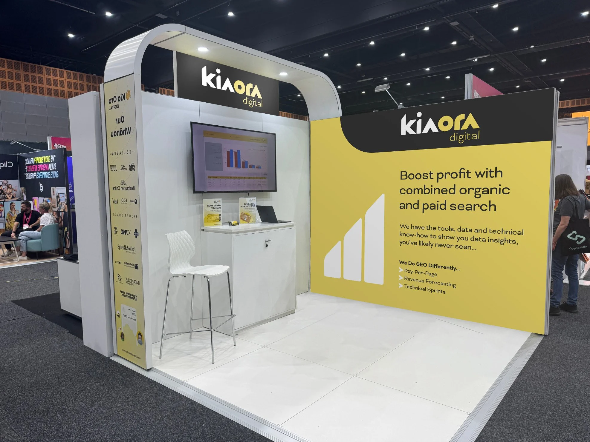
Once the logo got approved, it wasn’t time to get a brand guide done. It was urgency, there were trade shows looming and Ben needed merch and booth designs.
A variety merch products were made to be dropped into the merch design system. Once a set of cool swag was made it was time to get onto the booth design. Various itterations were created with different messaging and colour hierarchy.
The booth design was a flipped version of last 2024s event. I took a photo of last years booth and reflected it. The booth has some really nice flowing curve structures and those were incorporated into the design to help with hierarchy flow.
Designing the booth along with some website concepts in FIgma were part of creating the new brand voice for Kia Ora. A colour palette that can be both subtle and striking.
Softer colours were chosen for the booth branding, going for an easy feel, simplifying complex data concepts with strong brand contrasts.


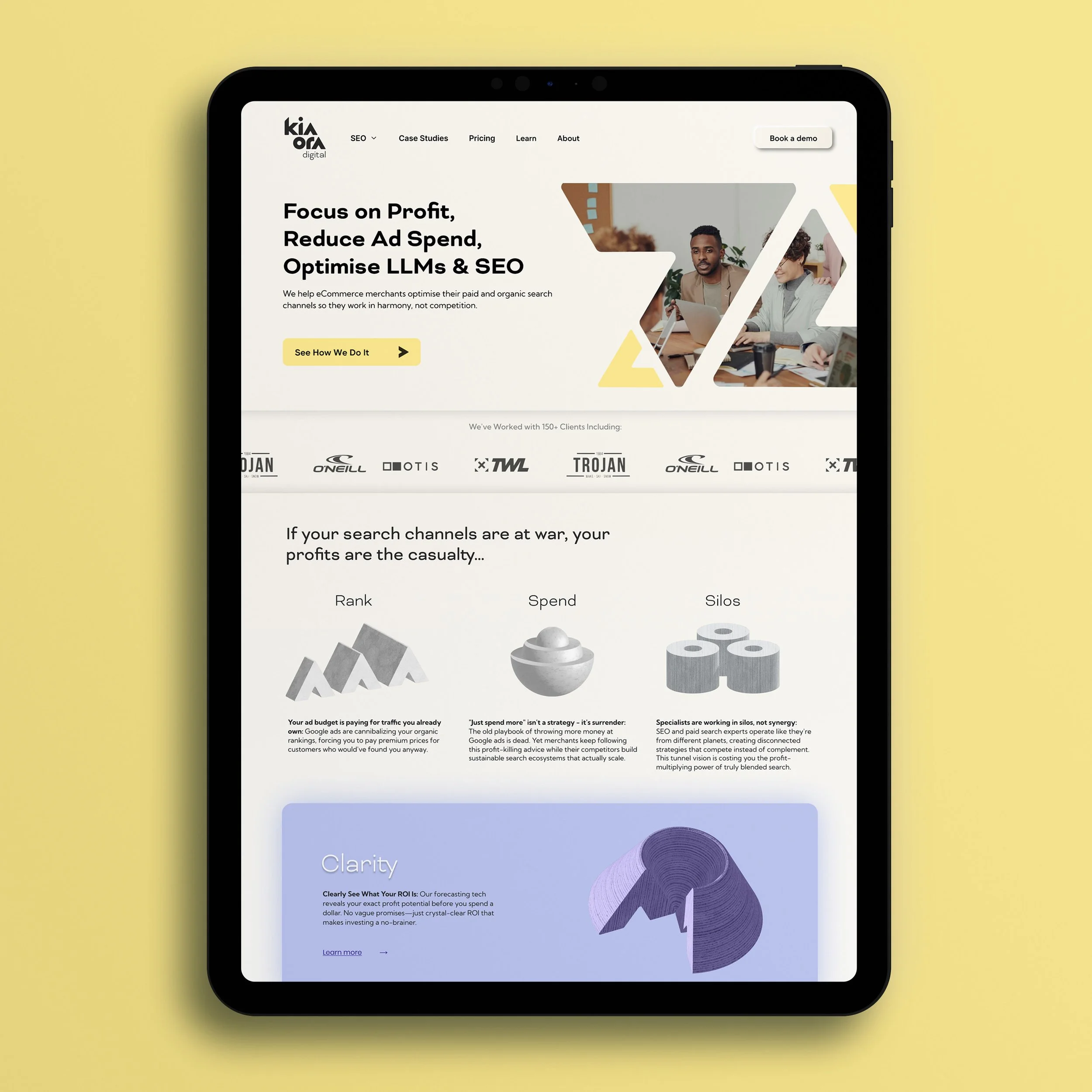
Website re-launch
Kia Ora Digital is an intenational company with global offices. The website update was focussed on the Australian domain first as that’s where the event was happening. There were multiple brand directions that were explored.
The custom typography of the logo was made up of geometric shapes. Those letterforms and shapes were refined to become the final logo. Once we had that final logo, each letter was extracted and experimented with to the brand values through the design styles.
I experimented with growth metaphors and 3D solid objects. Meanwhile an international team of other design / UI / UX people were working together in Figma. That was a great way to get the brand voice and styling done hyper fast. Great teamwork and collobaration across the globe.
From sketch to implementation in a matter of weeks. A complete brand refresh, merch design, booth design and website update done in under a month for an international digital agency.
It was great to colloborate with the team, and this was another Wedge powered brand and offering solution.
The website got launched in time: www.kiaoradigital.com.au
And I was guiding the team through design, using attention to detail along with the creative solutions, and I love this feedback 😍


The original pencil sketches for the branding project.