Driver Training for TR Group: Phase 2
Refining the relaunch - improving the experience
Phase 2 is live, and it’s a refinement of the overall design. Originally the brand for DT and TR Group were both a very strong yellow. While this strong yellow punched strong, with a solid brand feel, the user time on the site is high and we managed to get some wiggle room to go and create with some colour freedom.
One thing that happened in between these phases was Auckland Design Week. I had been creating my keynote talk for the conference and breaking design elements down to their most basic formats. It was during this time I got to learn myself by having to teach these base elemental design rules and values.
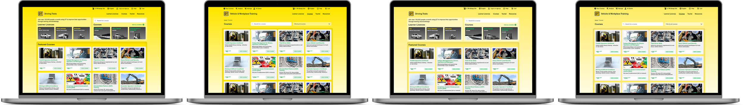
Phase one left, and the refined phase two right. Taking on learnings and feedback.
Teach and Learn
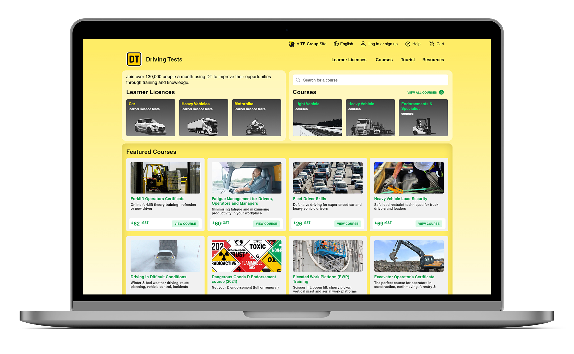
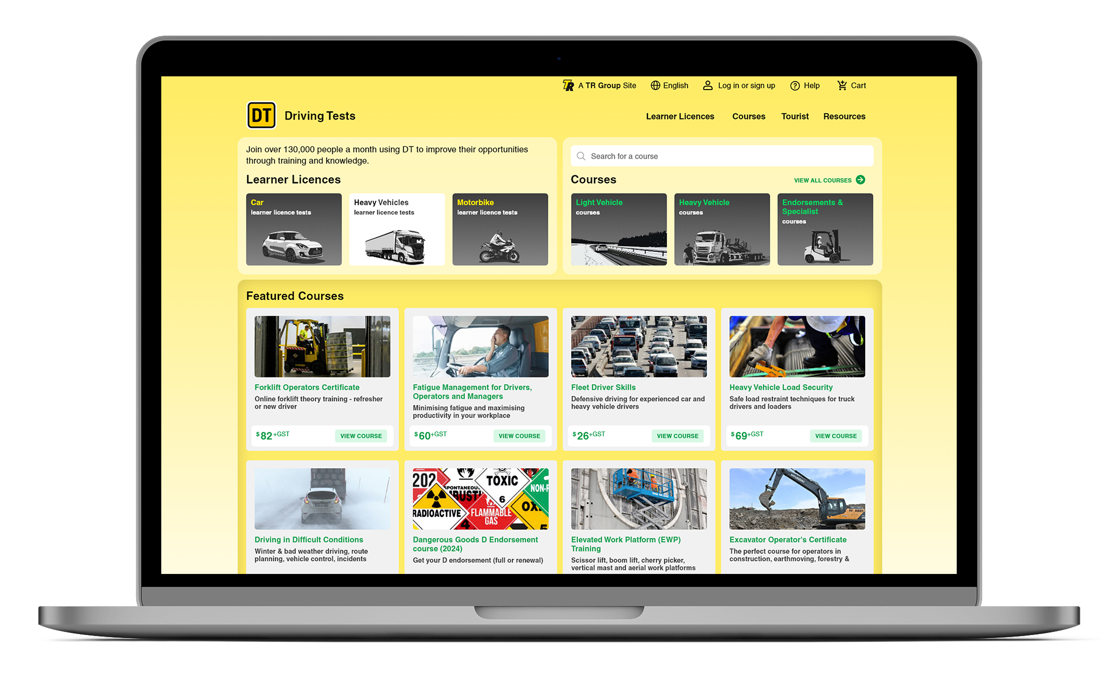
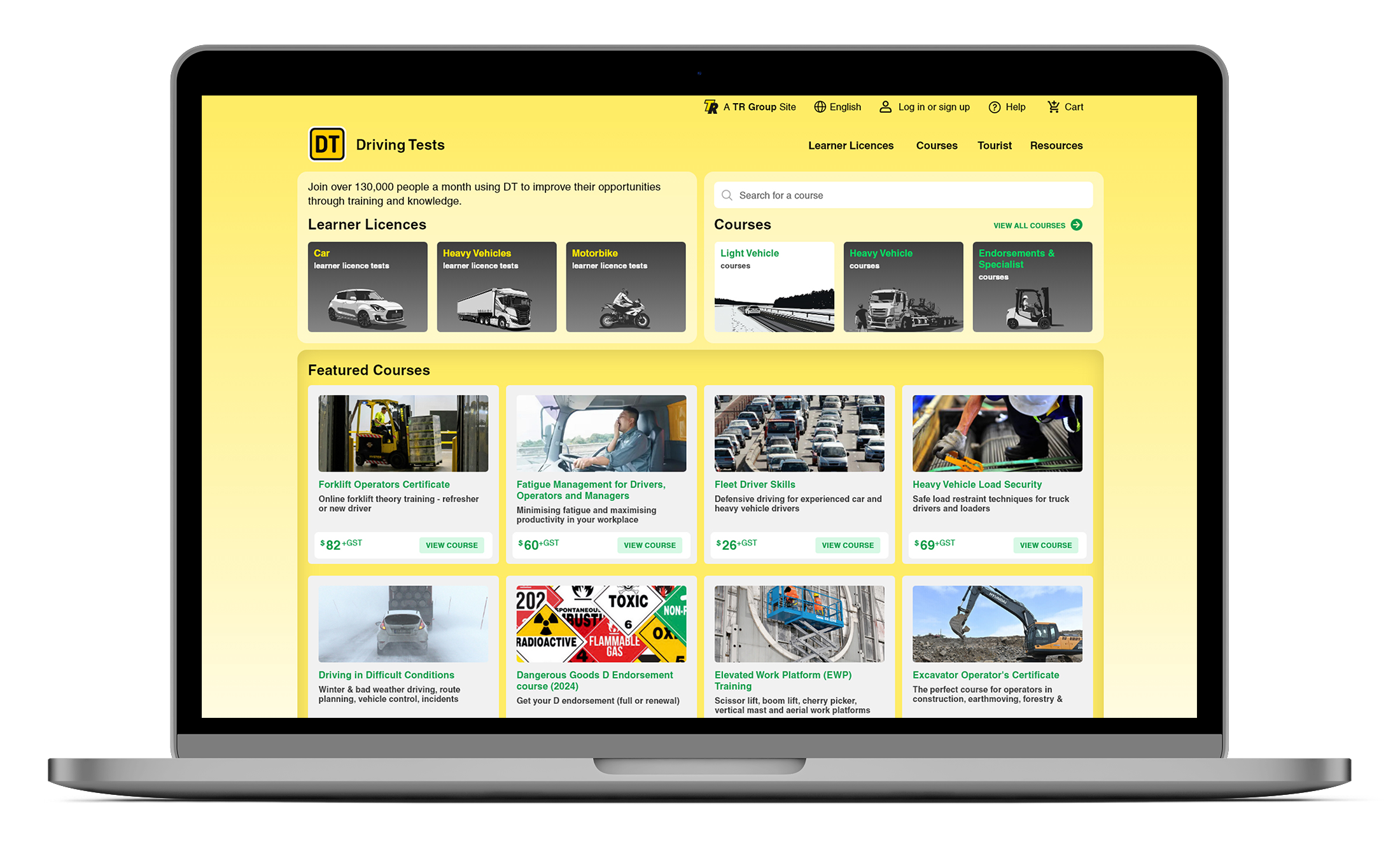
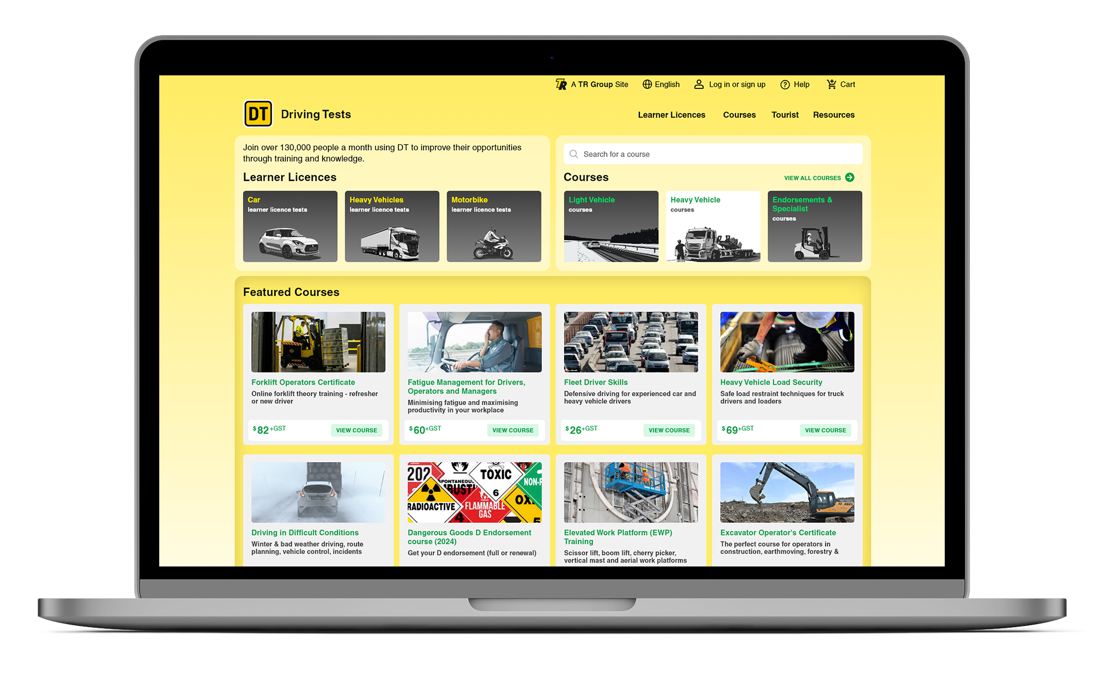
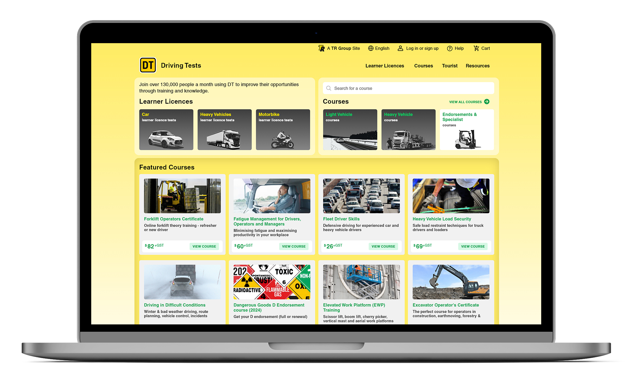
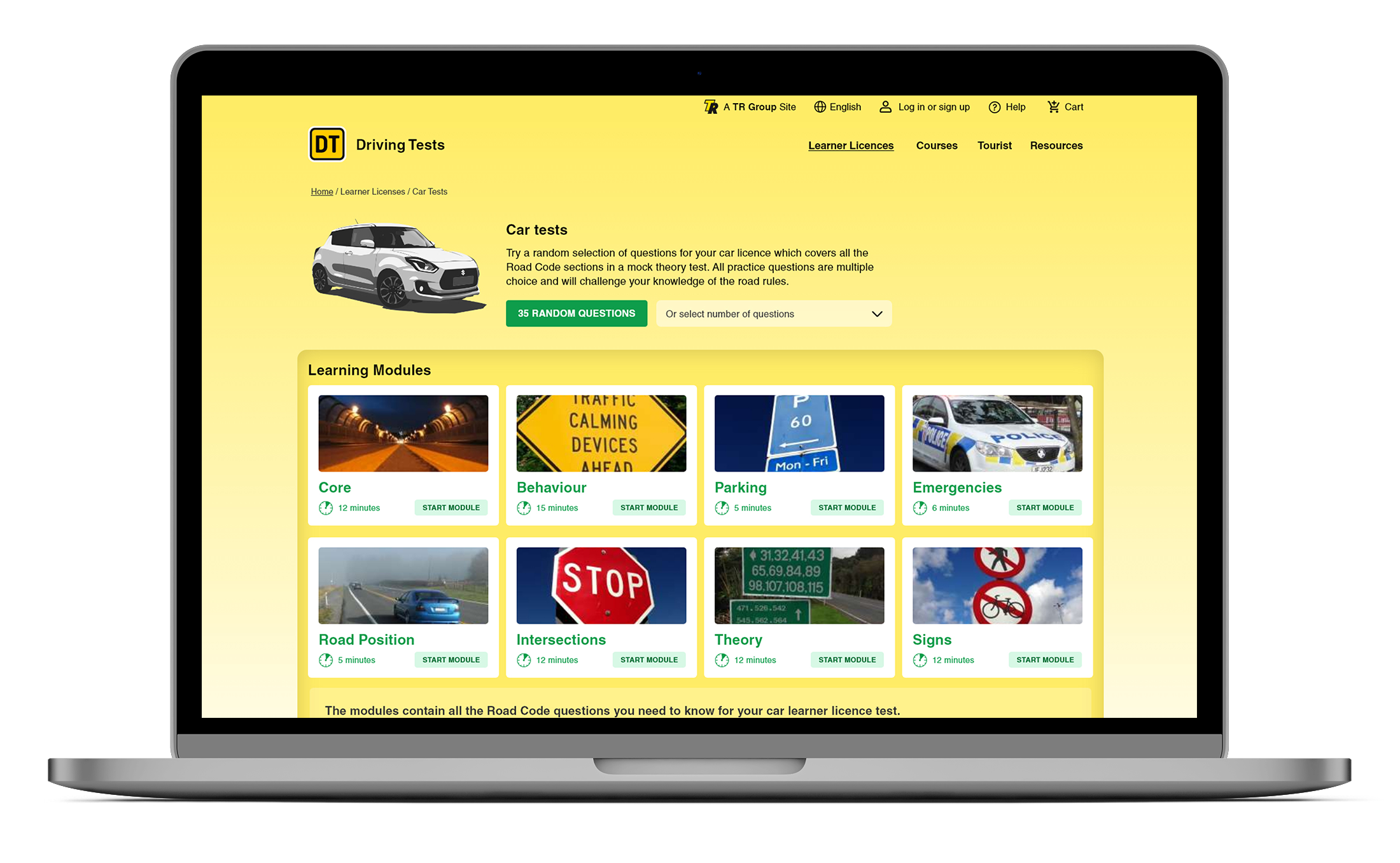
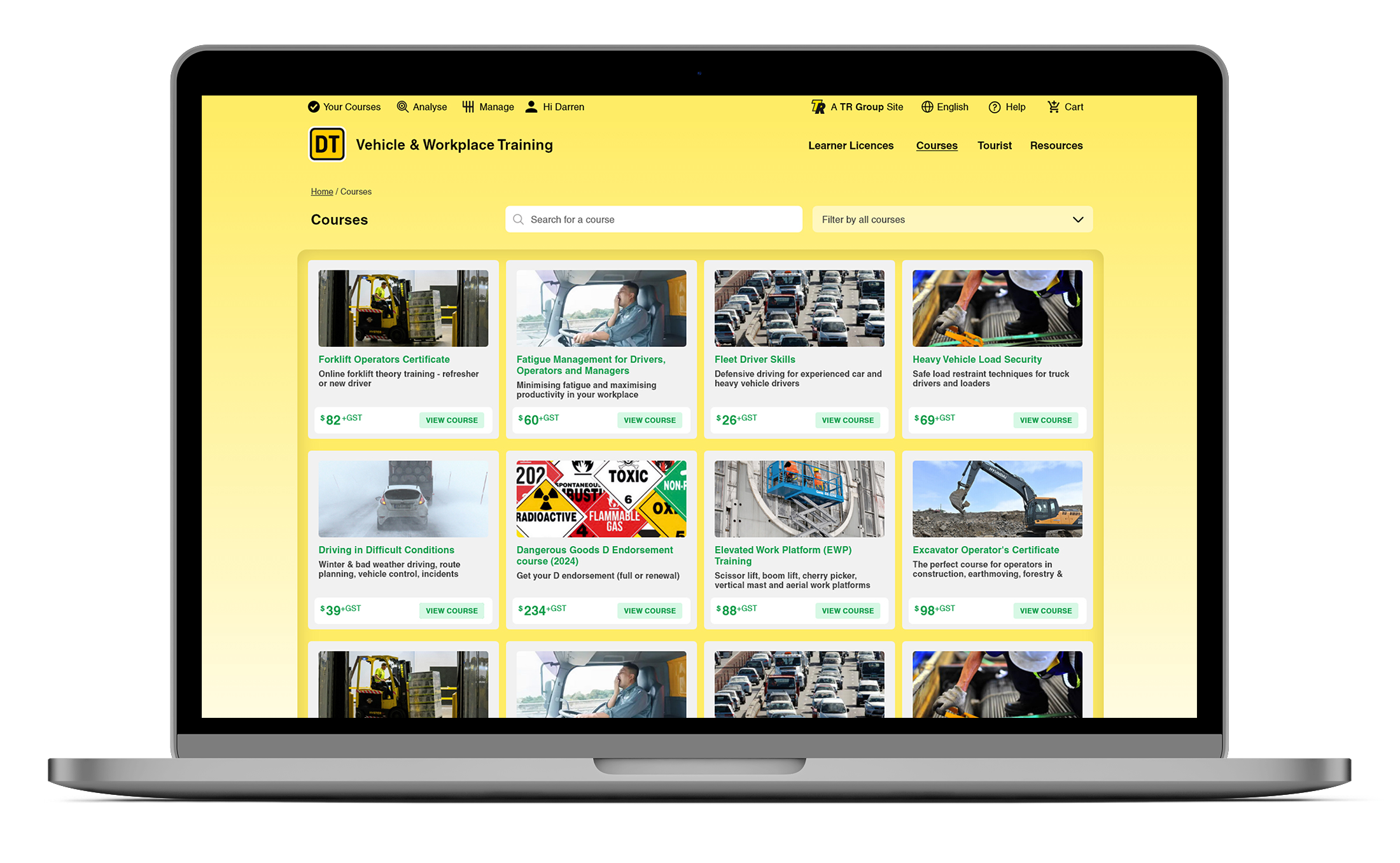
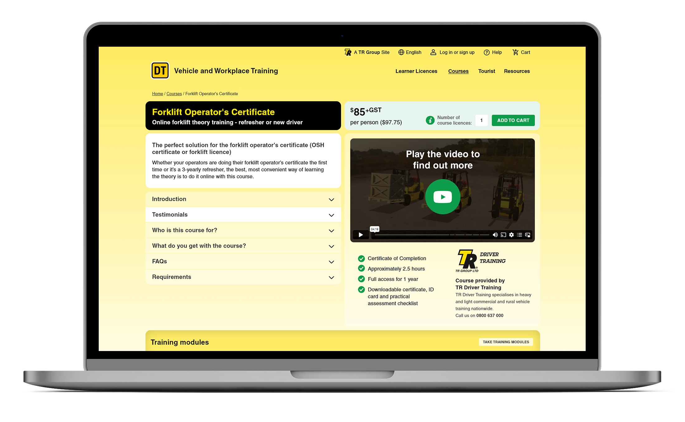
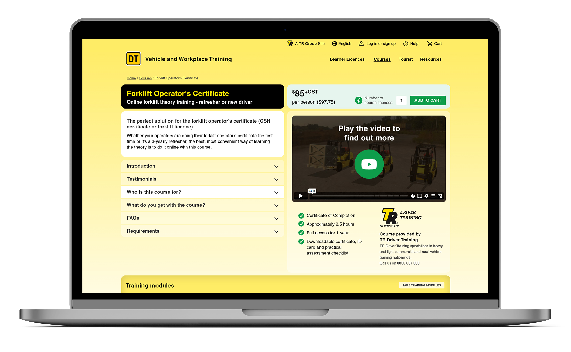
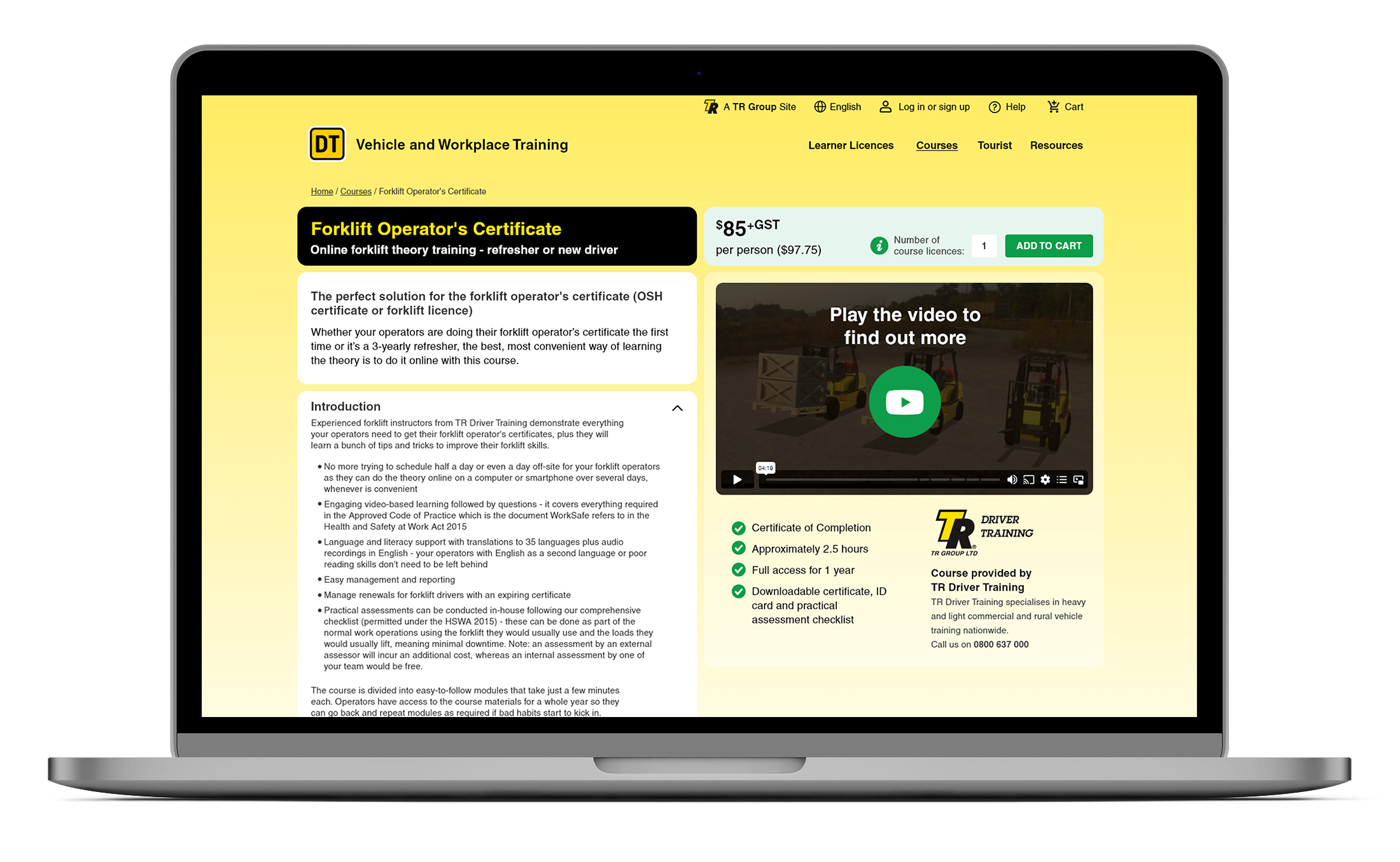
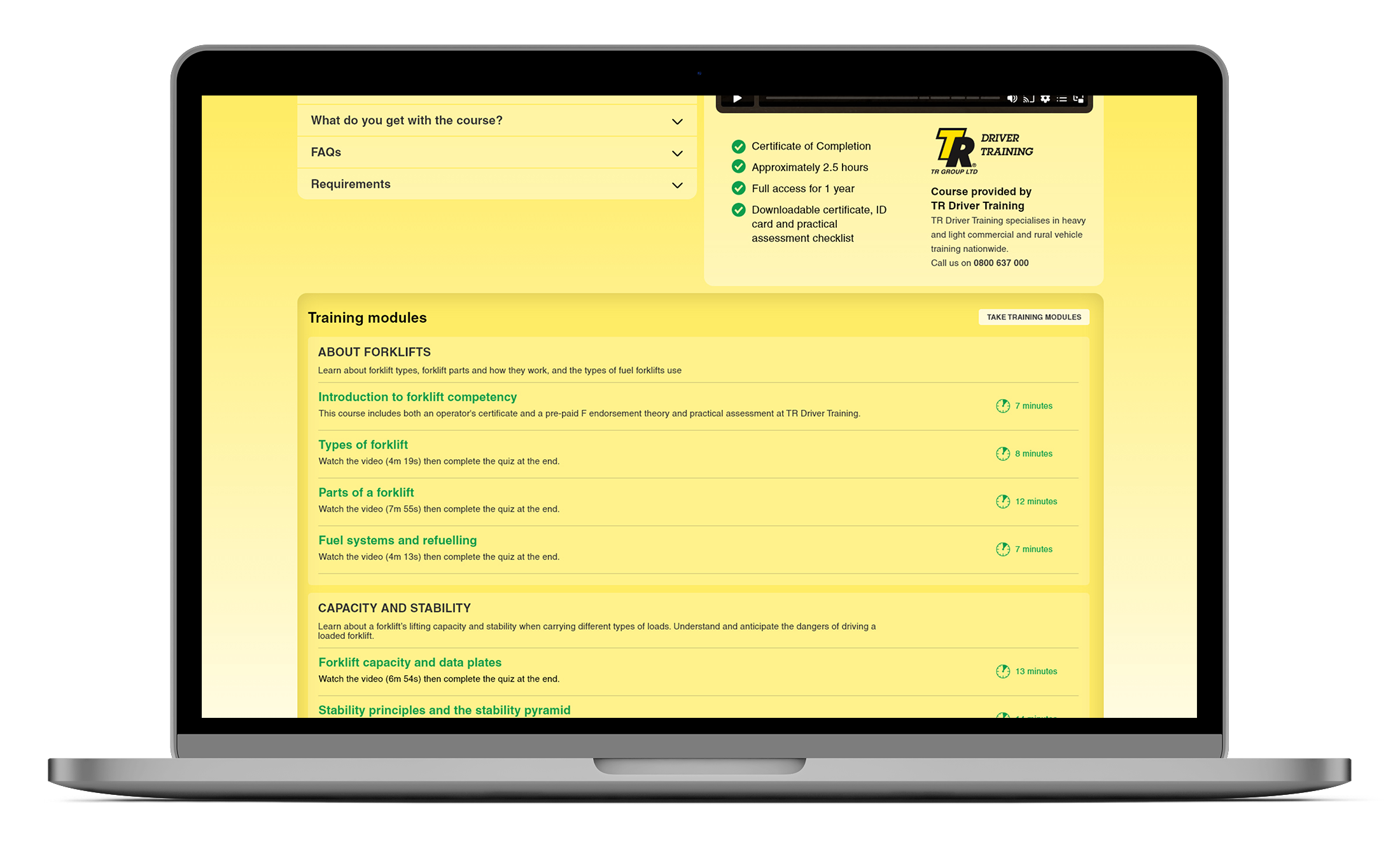
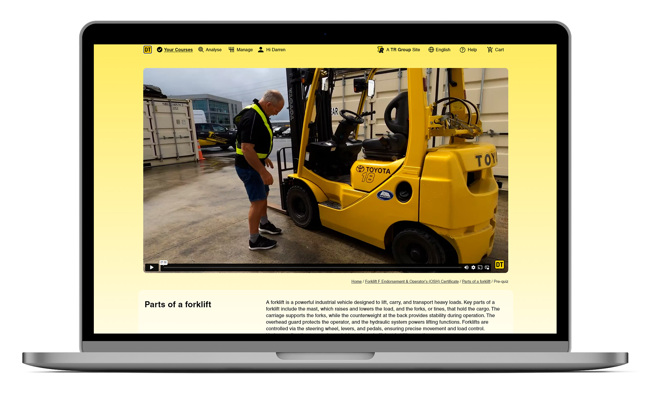
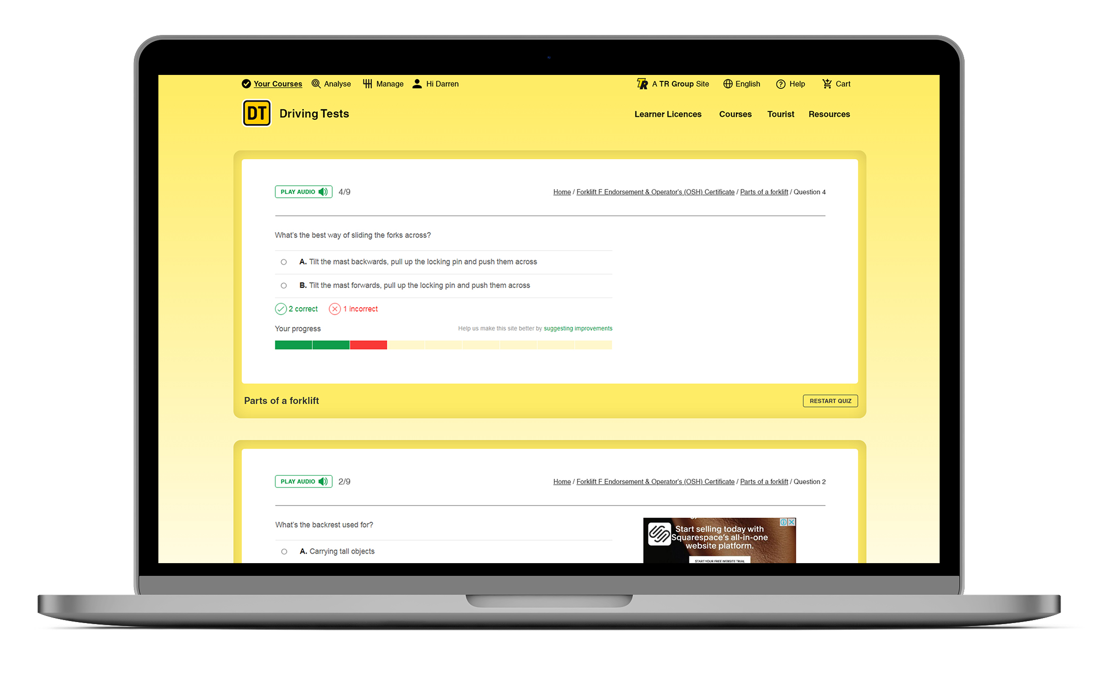
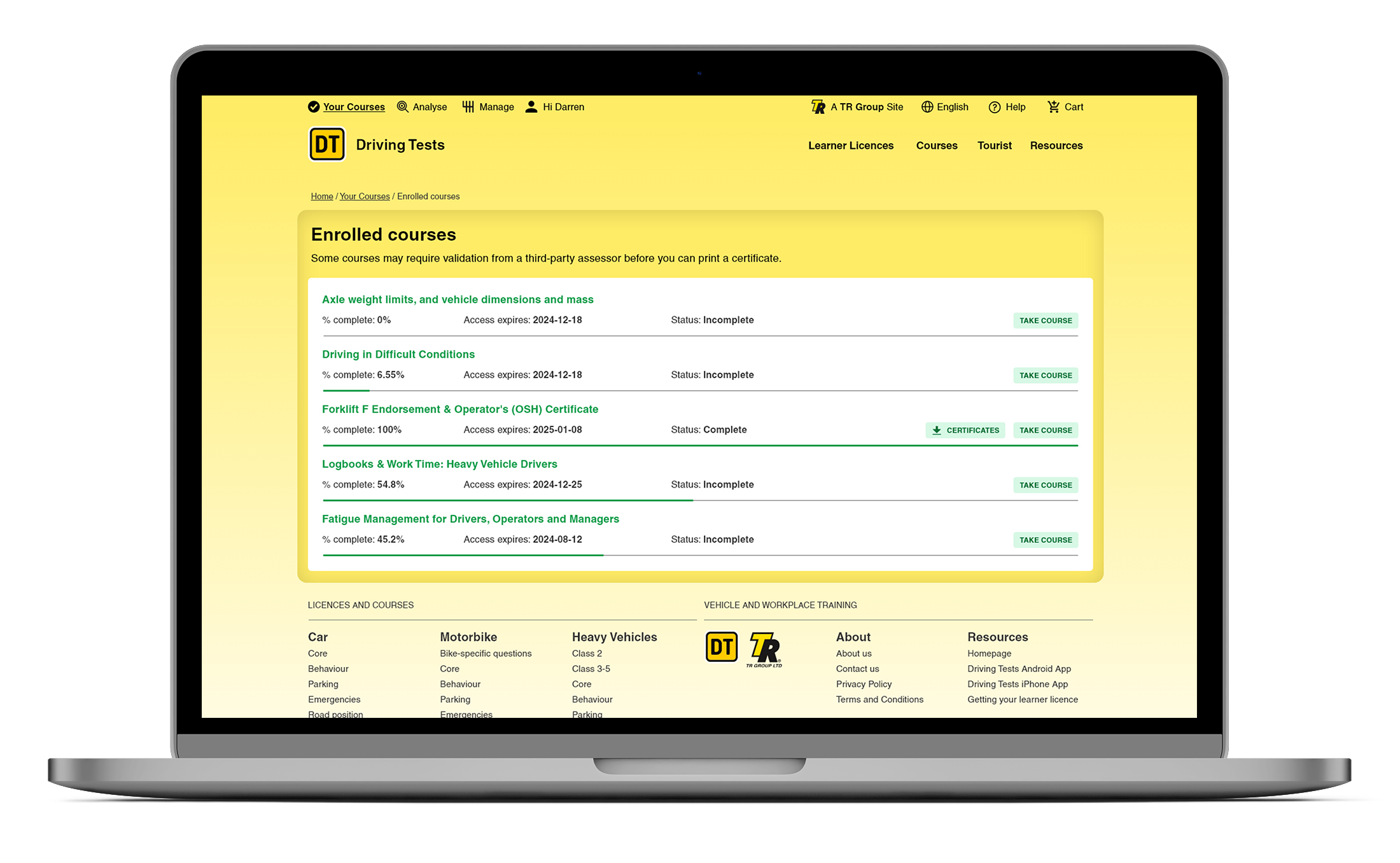
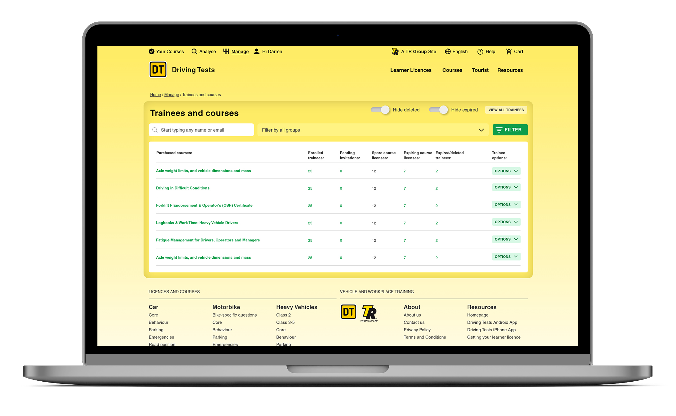
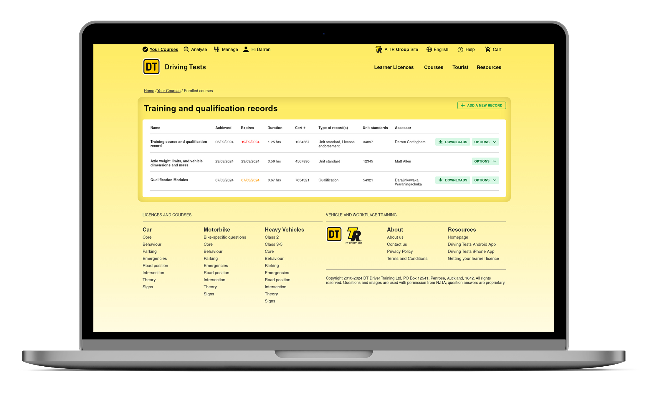
One of the things about the DT website is sheer scale of it. Add that scale with different profile persona view-states, from a young yet to be driver doing their study on the free site with ads, to one of New Zealand’s largest companies handling training for over 1000 of their staff. There’s an extensive management system in the background that’s not seen by all. There has to be an allowance for user-type views, and admin solutions for the back end.
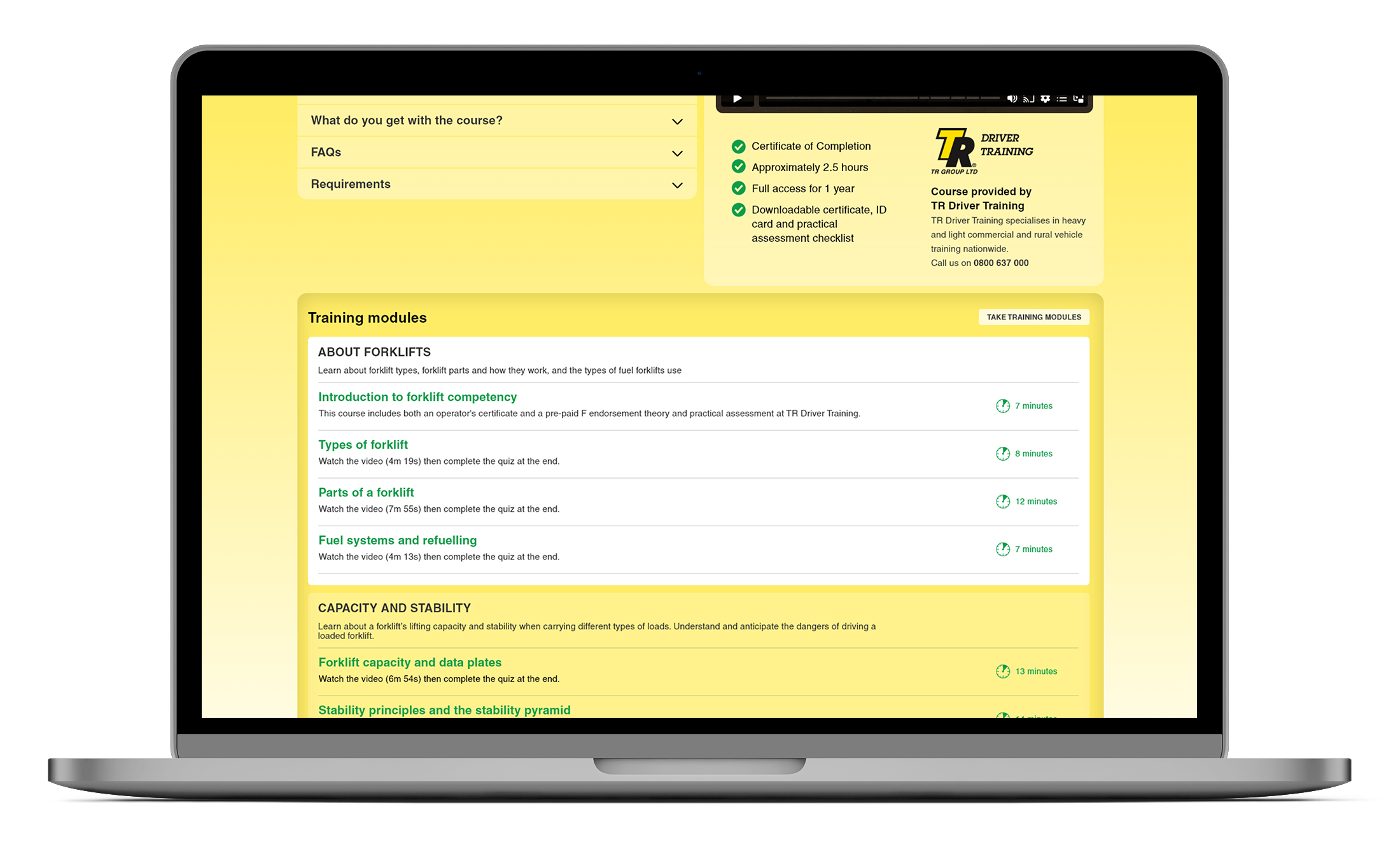
The main improvement came from elemenal load reduction. Firstly I had done the elemental load breakdown at Auckland Design Week, you can see the podcast of that here. So in the meantime I came back to doing some more updates on the page designs for DT, and noticed I had a lot of wired buttons around heavy duty layouts. So I went about reducing elemental load where I could for phase two.
The screenshots also show more of the user interactive hot spot rollovers too. Desktop uses a range of rollover treatments to focus the user to those areas.
Overall, the combination of the existing low noise sink holes, and the solid buttons made a big difference to the overall visual noise factor on busy pages.
A combination of page update improvements and user interface improvements boosted the usability :)