PEP Brand Suite - From a Single Logo to a Full Ecosystem: Mata Designs the pep Brand Family
Some brand projects are a single commission. Others become a creative partnership that grows with the client's vision.
The pep brand family is very much the latter: a suite of distinct yet interconnected identities, each one designed to carry its own weight while still belonging to the same purposeful universe.
It started with a logo. It became something far more layered.
Where it began
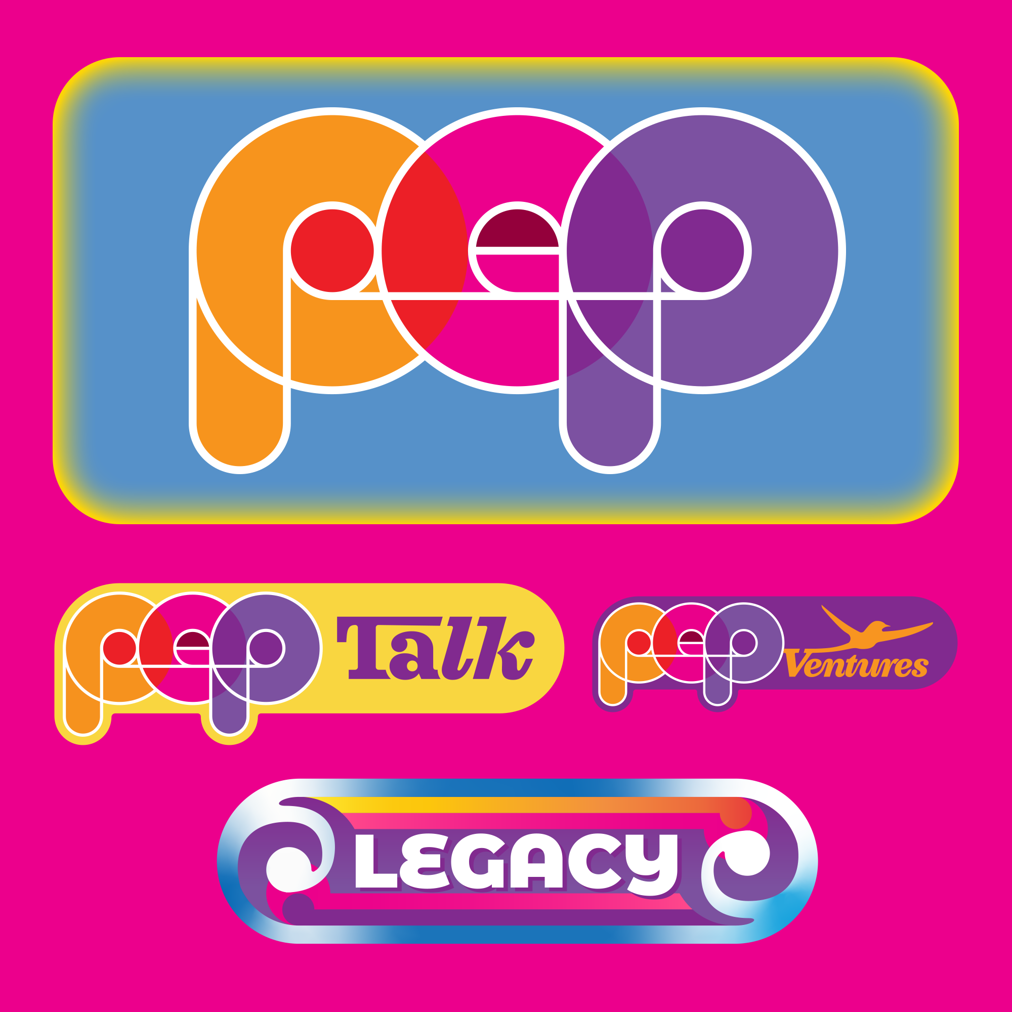
pep — Purpose Empowered People
The founding mark. A distilled expression of drive, positivity, and human potential.
The brief for pep — Purpose Empowered People — was to create a mark that felt energised without being loud, and purposeful without being corporate. Three letters carry a lot of weight when the idea behind them is big, so the design process began by stripping everything back to what the word itself communicates: momentum, optimism, and the spark that moves people forward.
The resulting logo lives in that sweet spot between bold and approachable. It holds its own at small scale on a social tile and scales confidently onto larger applications. Critically, it gave the whole project a visual DNA: a set of decisions about form, weight, and energy that would echo through everything built on top of it.
"Good brand work doesn't just answer the brief. It opens a door to everything the brand might become."
Finding a voice
pepTalk
A vlog content brand built for conversation, inspiration, and authentic connection.
Once the pep foundation was established, the next evolution was pepTalk: a content brand for vlog-format storytelling. This is where the pep identity had to stretch from a logo into a full media personality. Vlog content lives or dies by the strength of its visual brand. It needs to feel consistent across thumbnails, intro graphics, captions, and social cuts, all while remaining warm enough that viewers feel they're watching a person, not a production house.
pepTalk was designed to feel conversational and immediate. The typographic and colour system borrowed intelligently from the pep root mark, maintaining recognisability, while introducing its own sensibility suited to the fast-moving, human world of video content. The design work here was as much about building a toolkit as a logo: giving creators within the pepTalk ecosystem the assets they need to show up consistently, wherever their audience finds them.
Building for growth
pepVentures
An investment-focused brand conveying confidence, ambition, and forward motion.
The third strand of the family marked a significant shift in tone. pepVentures, the investment opportunity arm, needed to carry the optimism of the pep DNA into a world where credibility and trust are everything. Investors and opportunity-seekers come to a brand like this looking for signals of substance, not just enthusiasm.
The design challenge was to thread a fine needle: retain enough visual connection to pep and pepTalk that the family cohesion is clear, while introducing the weight and gravitas appropriate to the investment space. The result is a brand that feels purposeful and ambitious: confident without being cold, bold without being speculative. It says this is where pep's purpose gets put to work.
The longest viewLegacy
Legacy
Connecting people with purpose across generations — past, present, and future.
The final and perhaps most resonant brand in the family is Legacy: a platform concept built around connecting people with purpose across generations. Where pep is about now, and pepVentures is about next, Legacy reaches in both directions, honouring the past while building bridges to the future.
Designing Legacy meant finding visual language that feels timeless rather than trend-driven. The mark needed to evoke continuity, connection, and depth: qualities that don't date. It also needed to sit comfortably within the pep family without simply repeating the same moves. Legacy is the most considered piece of the set, quieter in some ways, but perhaps the most enduring.
The idea of connecting people with purpose across generations is a genuinely beautiful brief, and the design process took that seriously. The result is a brand that doesn't shout. It endures.
The whole picture
Across all four brands, pep, pepTalk, pepVentures, and Legacy, the design work at Mata was about more than creating four separate identities. It was about building a coherent family: one that allows each member to stand alone in its own context, while making the connected vision unmistakable when seen together.
That kind of systemic brand thinking, where every mark is designed with an awareness of what sits beside it, is what separates a logo project from a brand architecture project. The pep family is the latter, and it's the kind of work that demonstrates what's possible when a client and designer are genuinely aligned on the long game.
Over 30 years of brand work, these are the projects that matter most: the ones where design serves a real human idea, and grows with it.
Mata is a full-brand creative studio based in Aotearoa New Zealand, specialising in brand strategy, identity design, digital design, and product. Open for new projects. Book a call with Matt